
Client: Ben
Project: Improving the online experience of the current ordering process of ordering a (phone) subscription for mobile provider Ben
Process: 1. Research, 2. Plan, 3. Design, 4. Prototype, 5. Test, 6. Deliver and 7. Improvement
Tools: Paper Prototyping, Adobe Photoshop, Adobe Illustrator, InVision
Result: Interactive prototype, documentation, presentation at Ben
1. Summary
The current ordering process of ordering a (phone) subscription of Ben needed improving. During two and a half months I have been working in a team and have been conducting a research, designing a lo- and hi-fi prototype and conducting an advise. The final result was used in improving the ordering process.
Role: During this project I have worked in a team with two other UX-UI designers via The Hague University of Applied Sciences. For this case study, I redesigned parts of the prototype. Think of this as version 2.0.
Situation: Ben is a Dutch telecomprovider. In 2002 Ben was taken over by T-Mobile International. In 2008 Ben returned to the market as a seperate company. Ben’s secret weapon is offering mobile telephones and sim only subscriptions for sharp prices. They don’t offer the latest mobile phones in their assortment, but they do have the best-selling prices.
Challenge: Ben wants an original improvement in the user experience of the current ordering process. An improvement that matches their image. It’s a challenge to match our concept with the target group.
Goal: To improve the user experience of the ordering process of Ben with an original angle of incidence within two and a half months, without losing the core values of Ben.
Main question
How can we improve the online experience of Ben?
Sub questions:
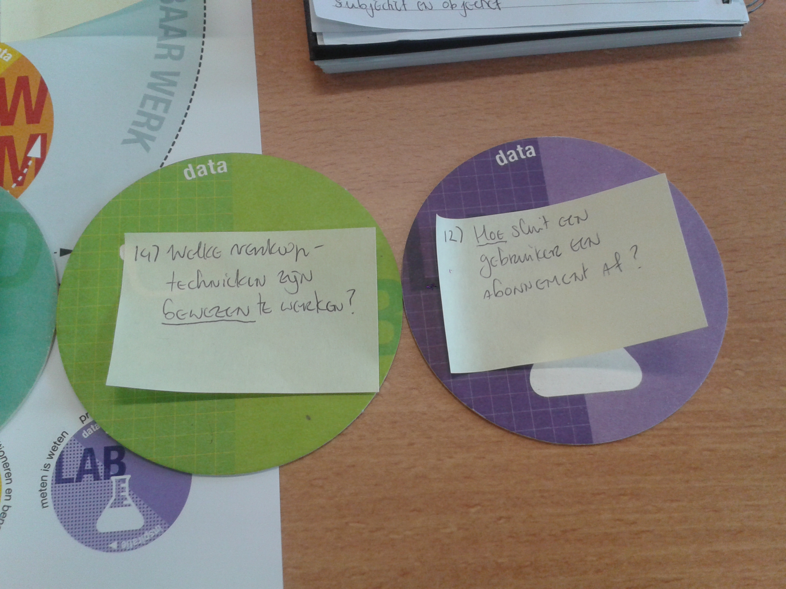
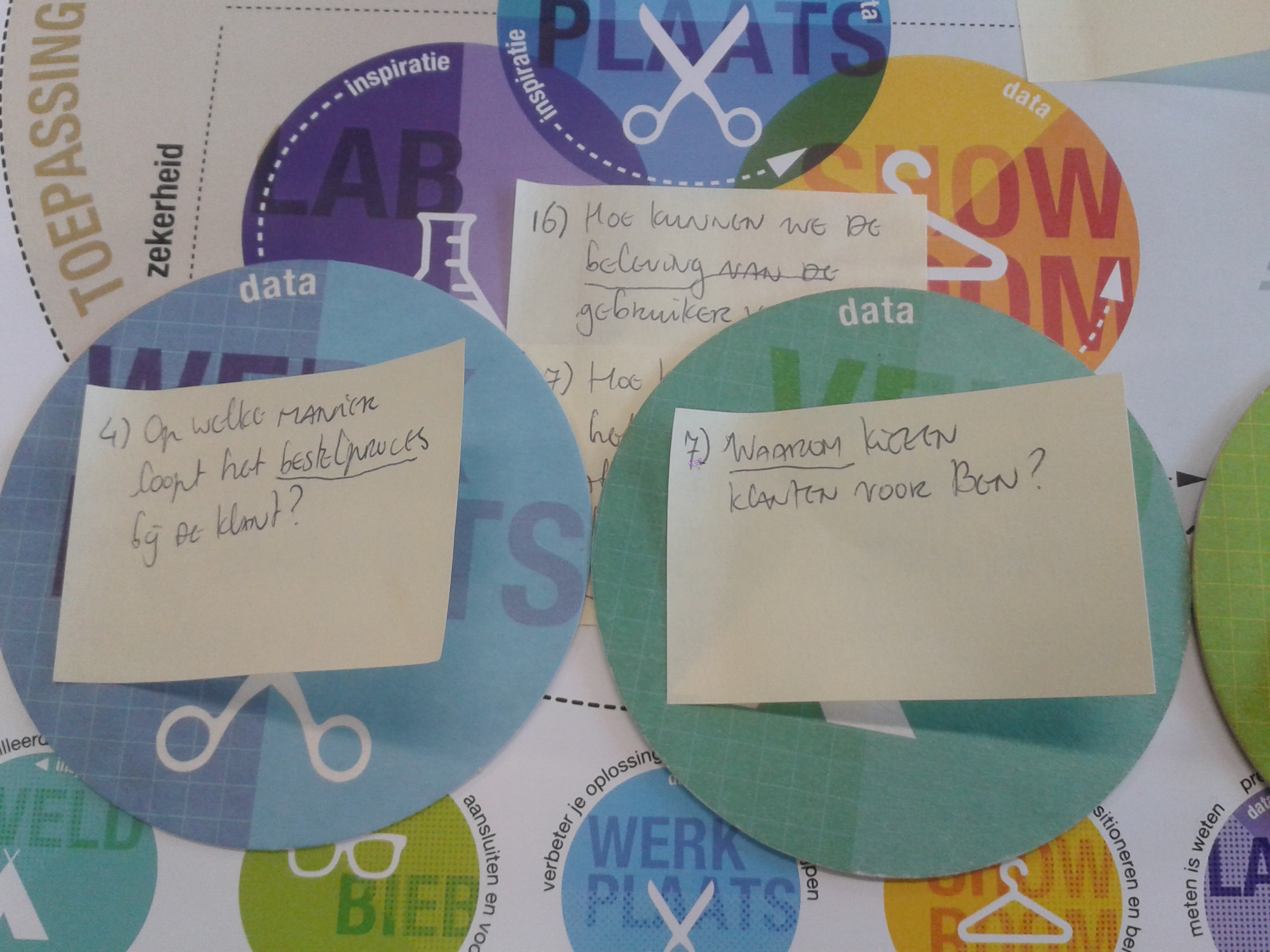
1. What is the current identity and image of Ben? 2. What is the target group of Ben? 3. How have other online stores organized the ordering process? 4. What is the current experience of the process of signing a subscription? 5. Which journey does the user whom subscribes at Ben experience?
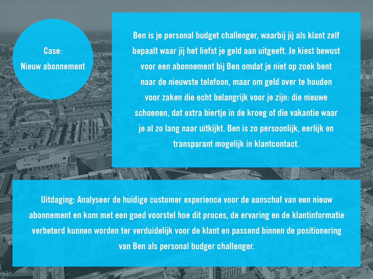
Case
The case of the client, which I made visual to serve as a ‘reminder’ during the different design phases project.
2. Research phase
The research phase consisted of researching the organisation, researching the target group and researching the competition.
Interviews
We have researched the organisation by, among other things, giving an depth interview. We also interviewed the target group: 10 different Ben clients.
Survey
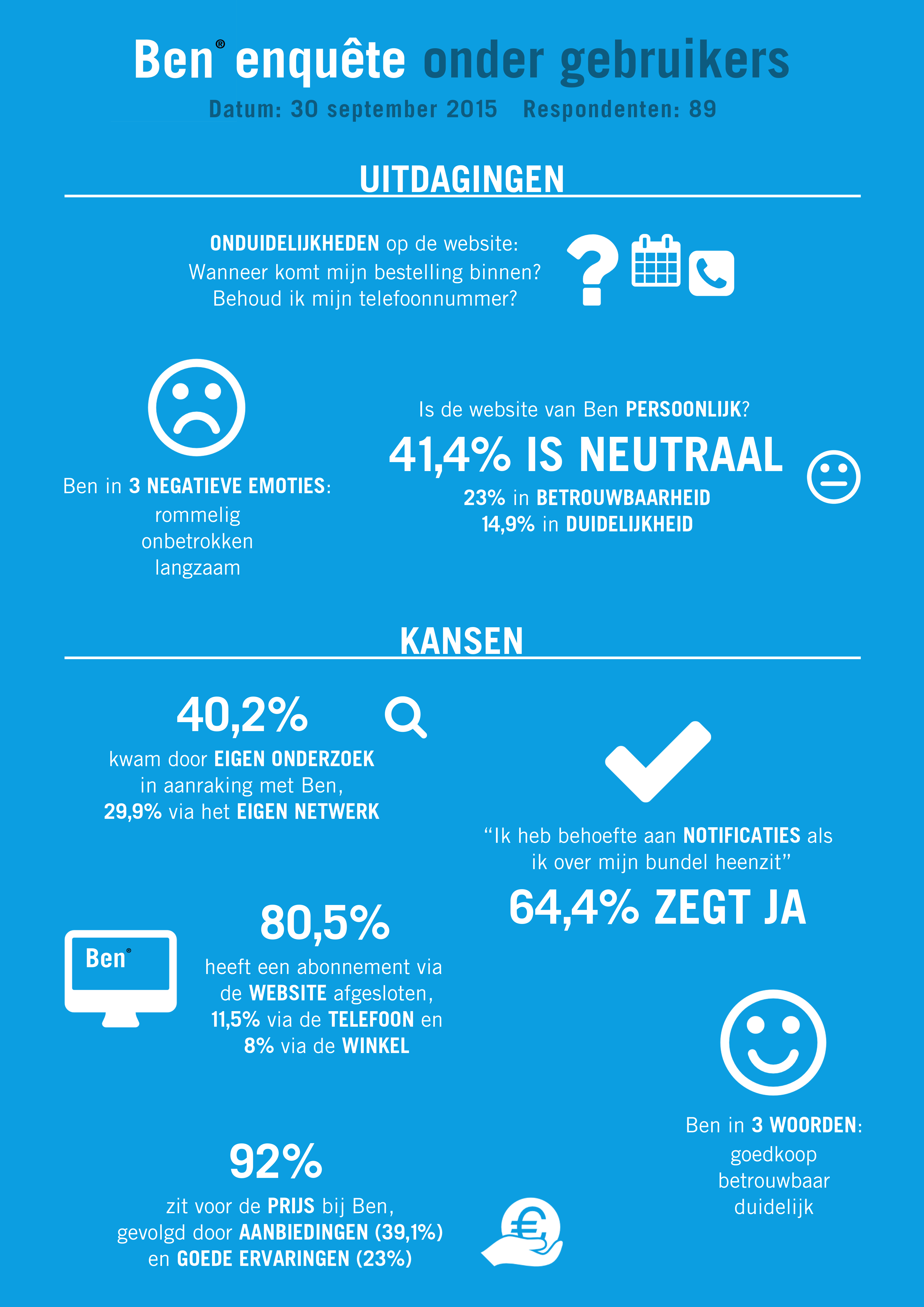
The survey has been prepared for Ben users who have applied for a subscription last year. 89 people responded. I created a poster (infographic) of the results which was used as a teaser for the final presentation and was hung in the office of Ben. It was very nice to have actually seen the poster during a tour of the company after the final presentation.
Scenario
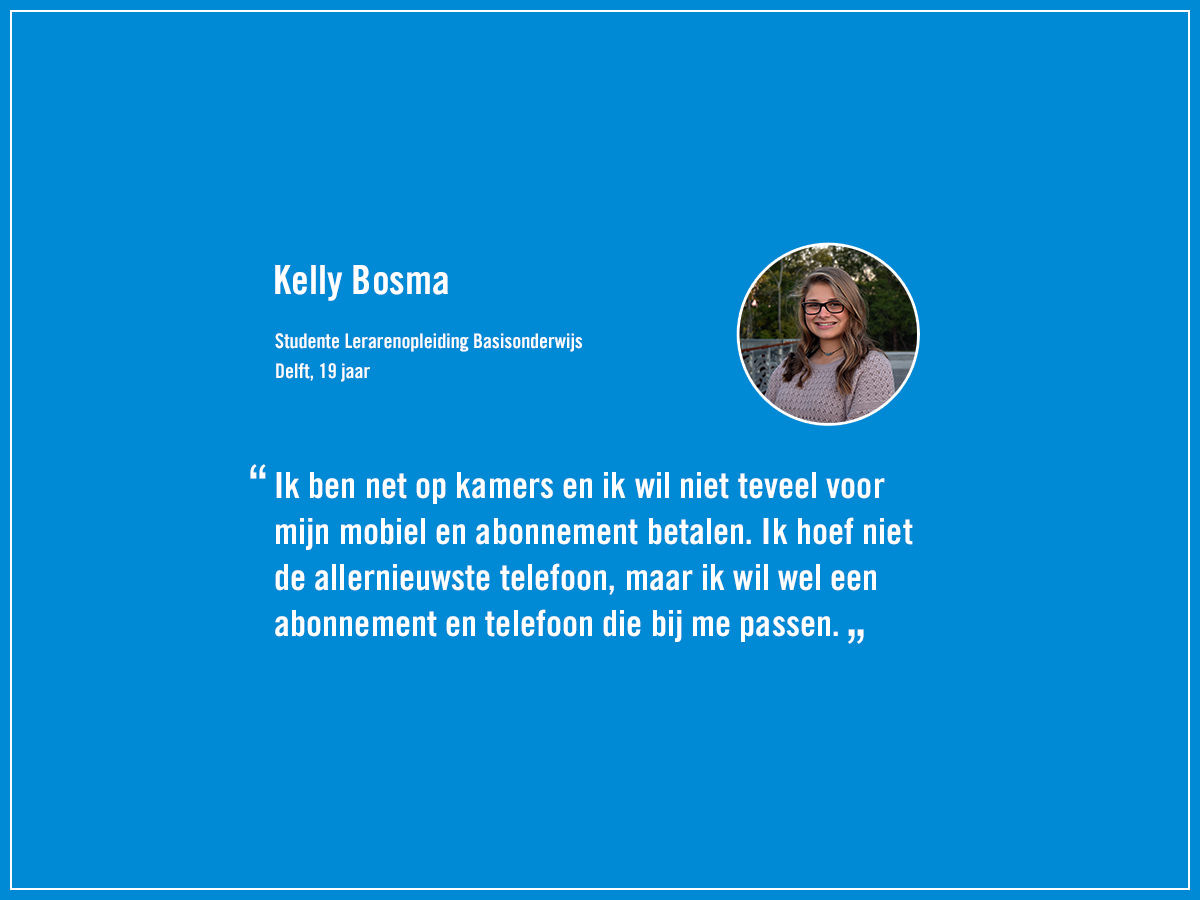
Kelly is 19 years old and just moved to live on her own in Delft. When she’s ready to go to school, her phone rings. It’s her mother. She tells her that her subscription has expired and that she has to pay for it herself now. Her mother says she wants to renew her subscription, but in that case she has to pay 60 euros a month. Now that Kelly is living on her own, 60 euros is too much, so she chooses not to extend her current subscription. She cycles to school. When she’s in school she tells her friends that she needs a new subscription and that she’d like a cheap subscription. Her friend Hedwig tells her that she has a subscription with Ben and only pays 20 euros a month. This makes Kelly enthusiastic and she directly checks the website of Ben. She finds it scary to subscribe, because this is her first time. After school she calls her mother. She tells about Ben and her mother tells her that she can only sign up for a subscription if she can miss the amount monthly. Kelly wants an iPhone 5. She checks the website and sees she doesn’t have to pay much a month. She signs up for a subscription and she’s glad. A few days after this her new phone arrives and she is very enthusiastic. Now she pays little for a subscription with a phone which perfectly suits her.
Persona
The target group of Ben is very diverse. Ben exists for young and old, male and female, thin and thick. Most of all Ben exists for everyone who wants to get the maximum amount of pleasure from his/her budget.
3. Concept phase
The concept phase consisted out of creating experience maps, using methodcarts and Dixit cards, creating a moodboard, conducting a brainstormsession, conducting a co-creation session and chosing a concept.
Experience maps
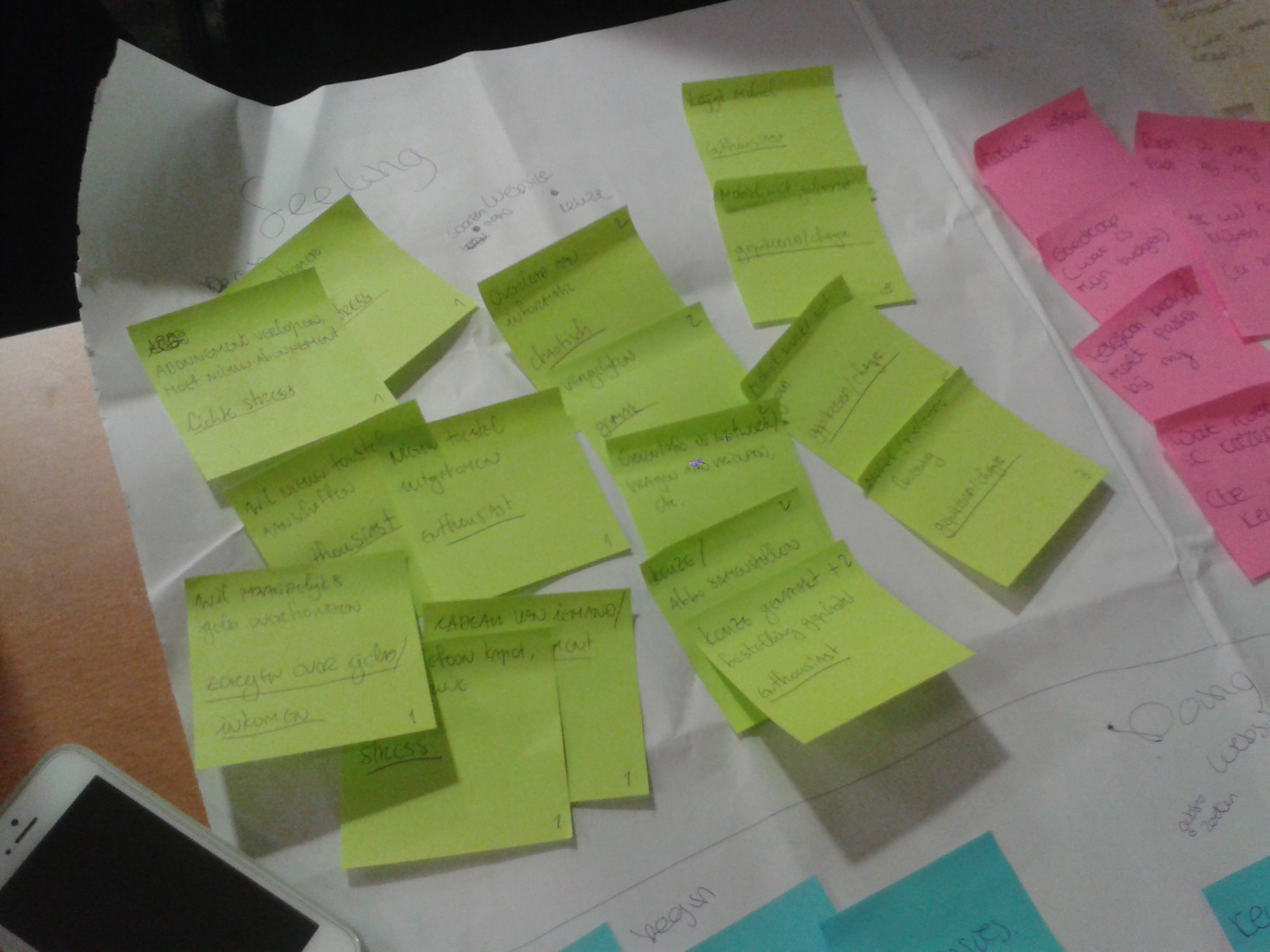
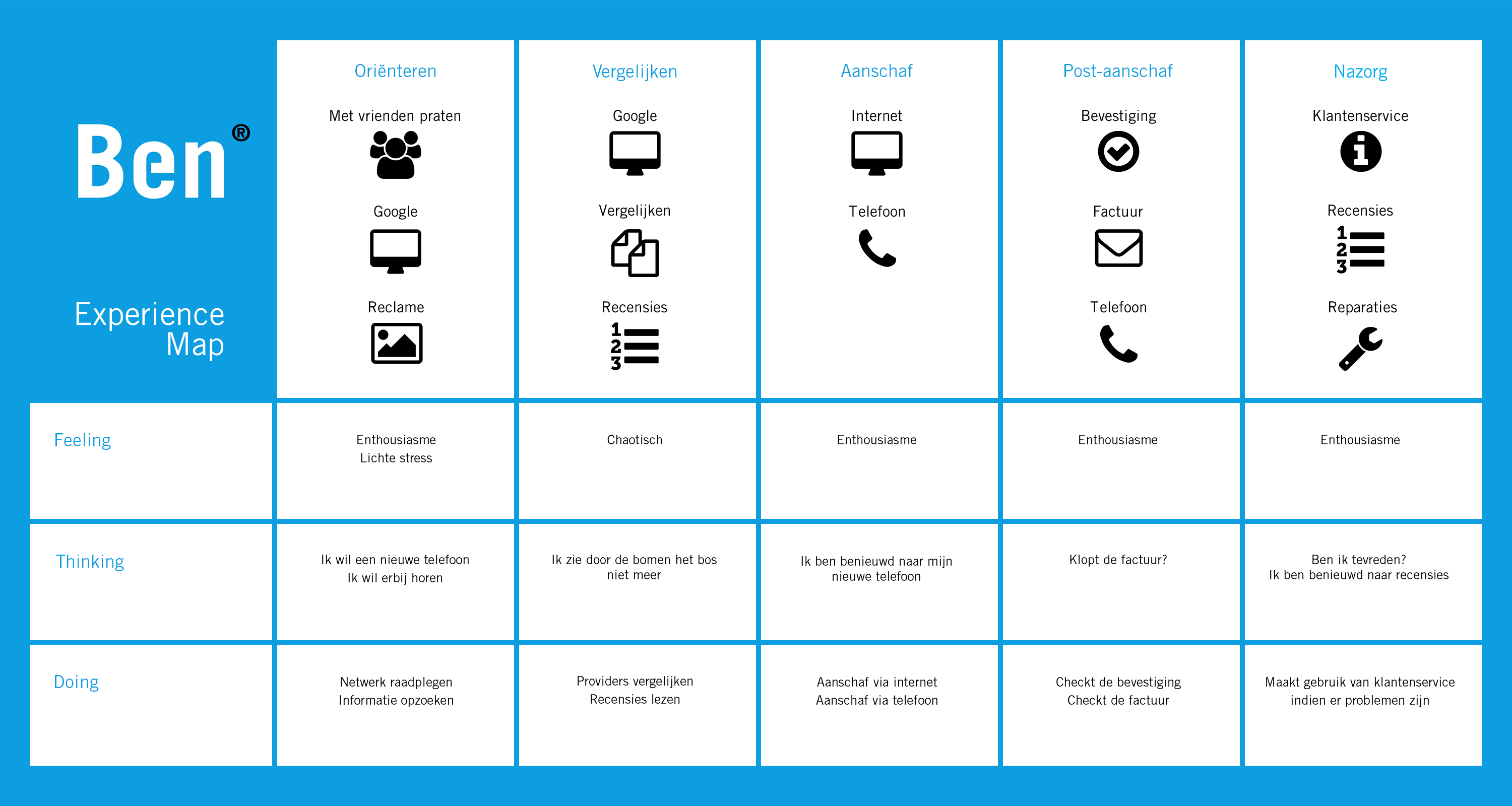
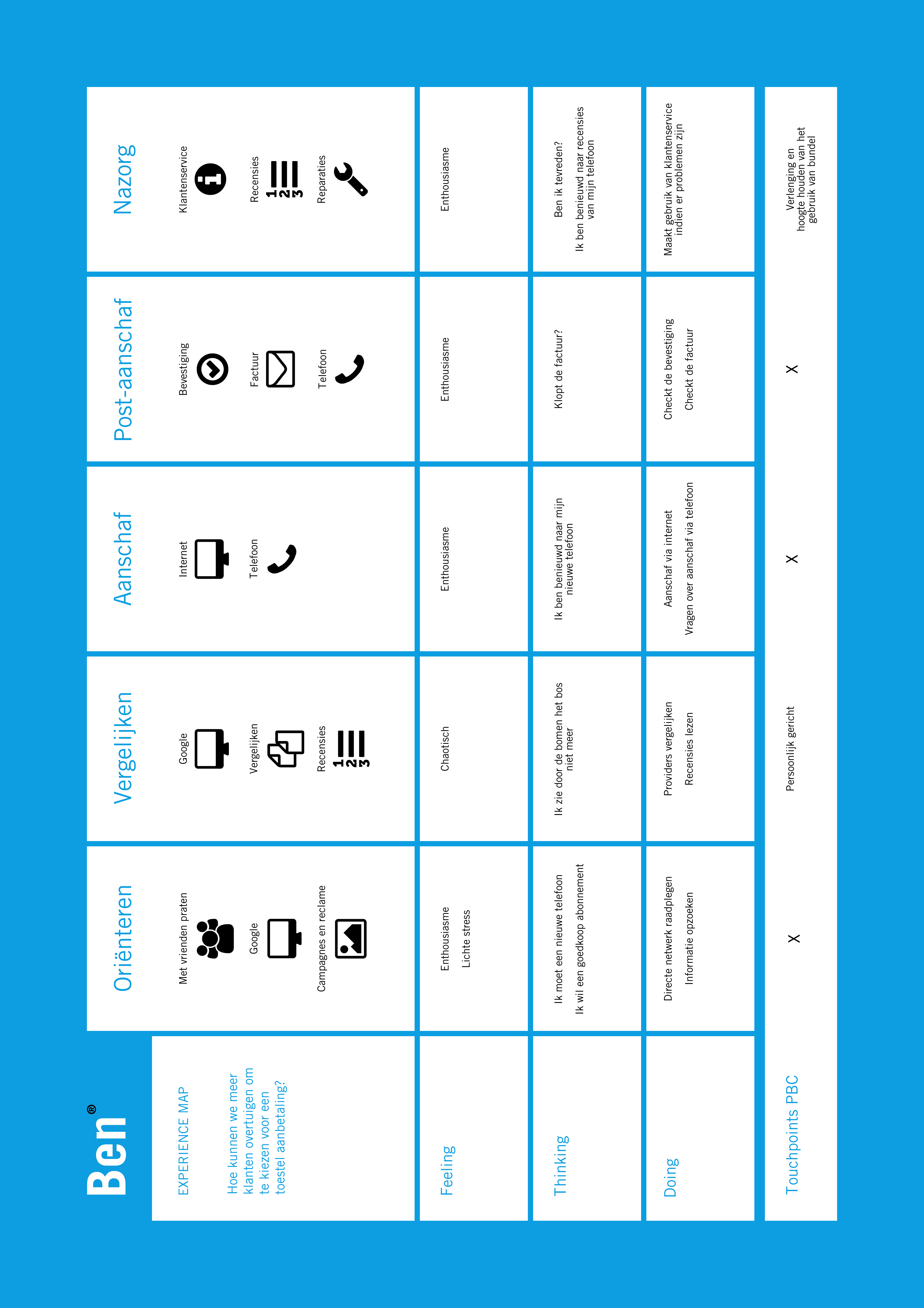
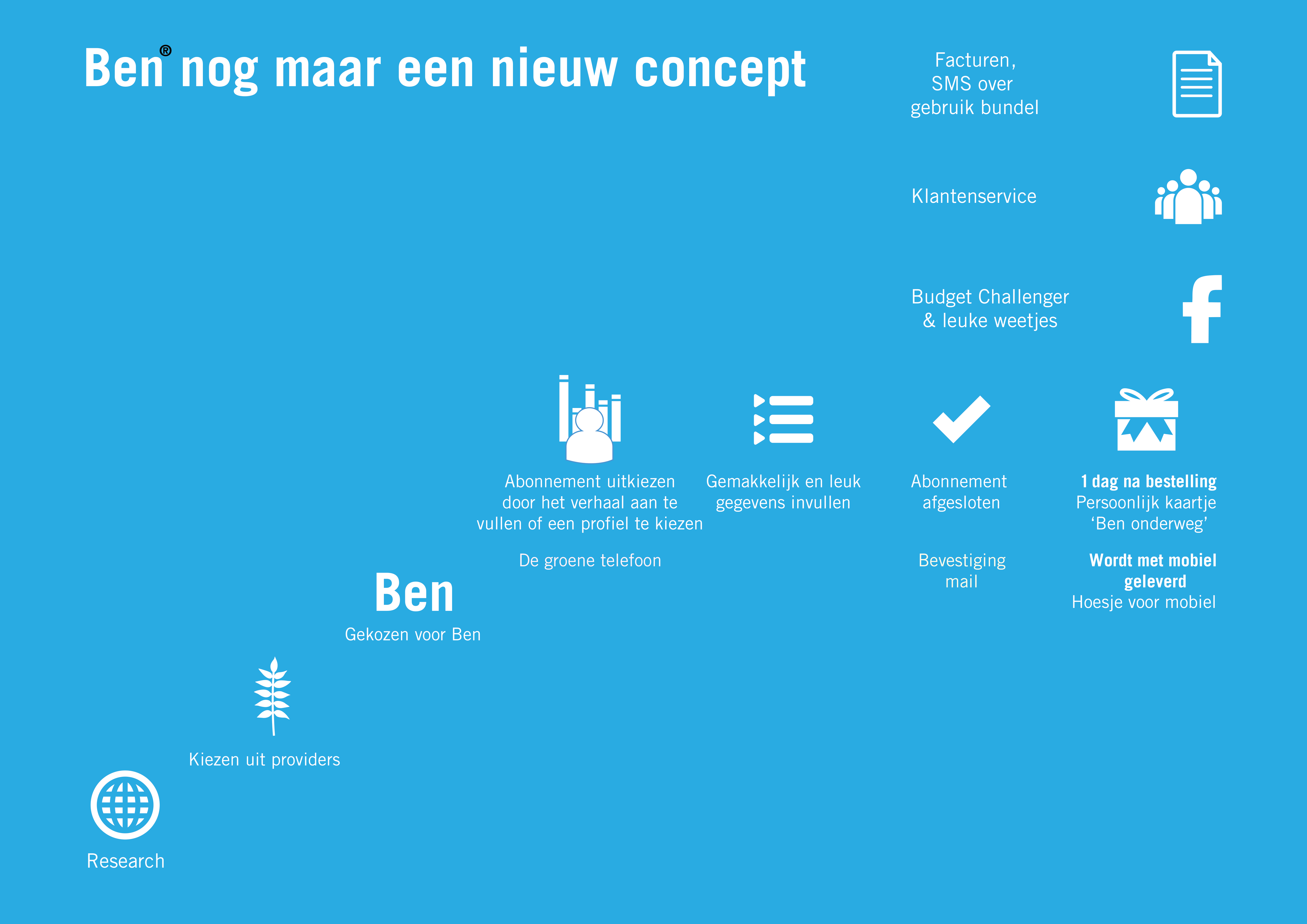
The experience map shows the user’s experience and bottlenecks. We have started to write all our thoughts on post-its. First of all, I have created an experience map of the current ordering process. Using the scenario I then created an experience map of our concept. The research questions ‘What is the current experience of the process of signing a subscription?’ and ‘Which journey does the user whom subscribes at Ben experience?’ have been answered.
Methodcards
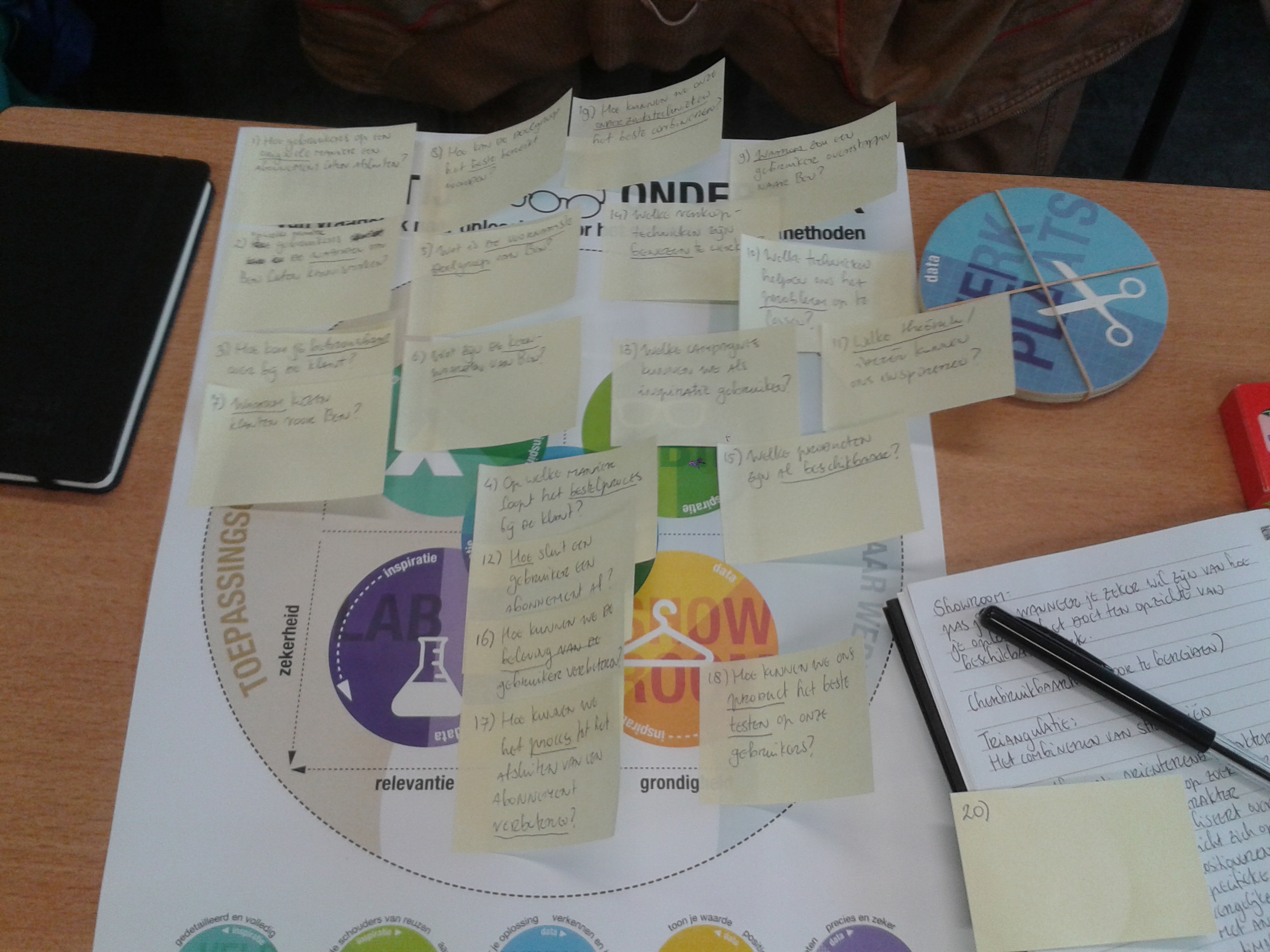
Via The Hague University of Applied Sciences teacher and researcher Koen van Turnhout of The University of Arnhem and Nijmegen (HAN) gave a lesson about the use of methodcards for research. Prior to class I have studied the piece ‘Een methodenkaart voor praktijkonderzoek’. I started working on it. The results can be seen above.
Co-creation session
During the co-creation session we’ve asked people what their ideal ordering process is and what improvement points are. We also asked them for personal experiences and emotions.
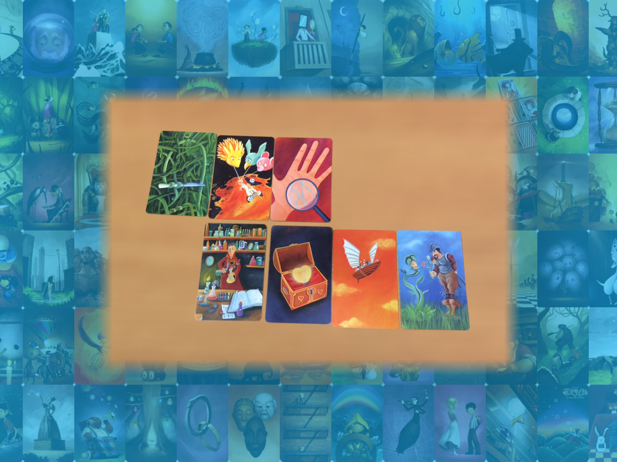
Dixit cards
In order to gain an original insight during the creating of concepts, we have gained inspiration by using the game Dixit, a card game, by mentioning just one word for each individual card. We made two piles: one pile of cards we could use and one pile of cards we could not use. From the stack of cards we could use, we created a user experience of our concept. The card on the left shows a user’s panic, not knowing which subscription he/she has to close. The second card indicates that there are too much choices. The third card indicates that the user compares. The fourth card indicates that the user compiles his/her subscription himself. The fifth card indicates that the user has terminated his/her subscription. The sixth card indicates that the user is satisfied and the seventh card indicates that Ben continues to provide service to its users.
Moodboard
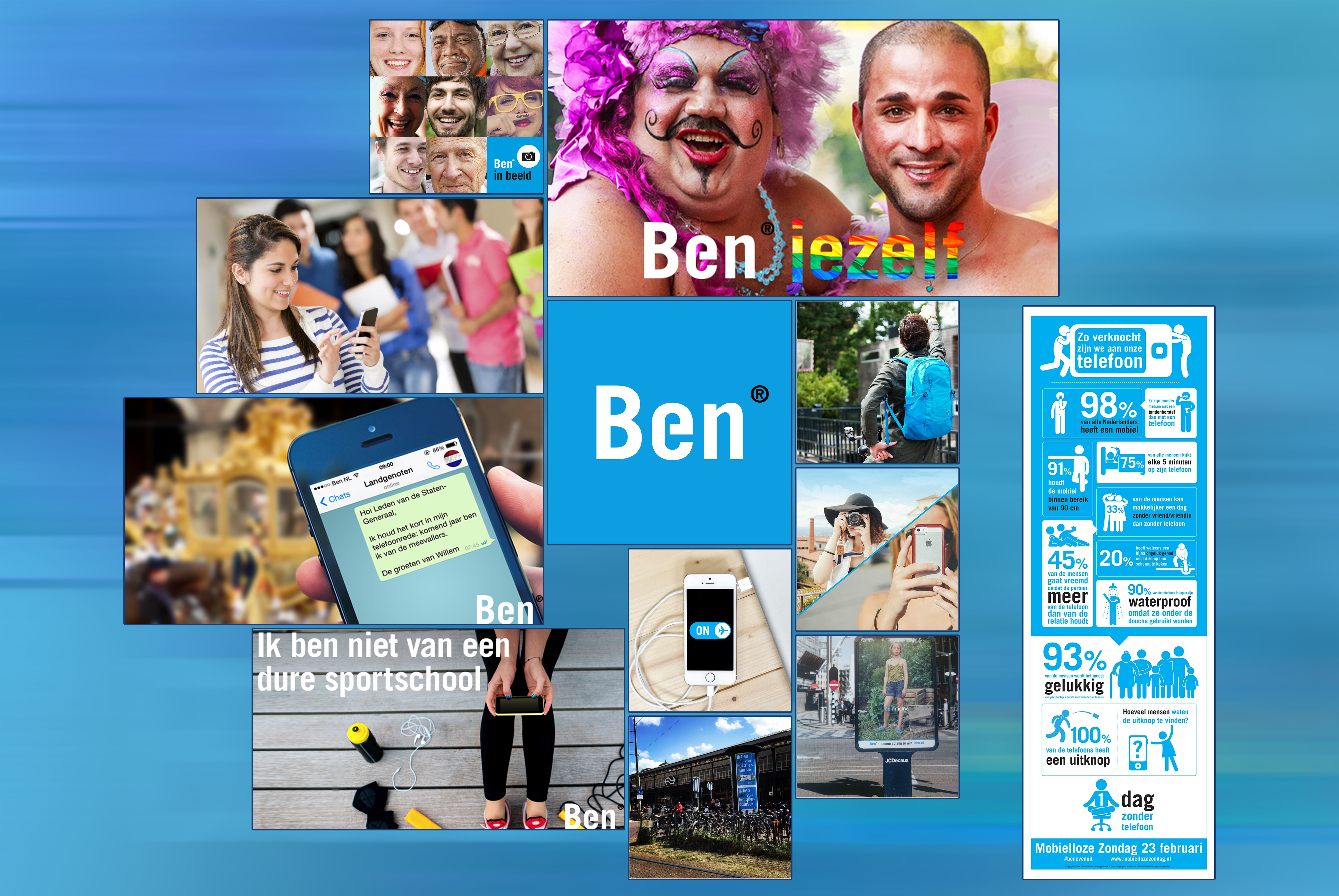
With the help of a moodboard, I gave Ben a face. I found the images via Ben’s social media channels. I also incorporated an infographic on phone usage.
Concept
Above the concept is visually shown to get a clearer picture of the new ordering process. The bottlenecks present in the current website have been tackled. It will be easier to find a customized subscription. It will be more approachable to close a subscription as well.
4. Design phase
The design phase consisted of designing a lo-fi prototype and testing the lo-fi prototype with the target group.
More images
Lo-fi prototype
Above four examples (homepage, profile-page, composing a phone subscription and first order-page) of the lo-fi prototype. The lo-fi prototype was tested on the target group.
Usability test
We first focused on Ben’s current ordering process and conducted a Heuristic Evaluation to determine where bottlenecks lie.
Main question:
Can the user reach his/her goal quickly, and does Ben’s atmosphere transform into the website?
Measure- and sub questions usability:
1. Can the user request a subscription without help? 2. In how many actions did the user reach his/her goal? 3. Has the user been jammed? 4. Are the profiles a good tool? 5. Are the tips in a logical place? 6. Has the tester been able to find the tips directly? (In how many actions?) 7. Does the tester find the information at the location that he/she expects? 8. Is the ordering process clear and user-friendly? 9. Has the tester not encountered any obstacles? 10. Is it clear where you can subscribe?
Measure- and sub questions ambiance:
1. What atmosphere is present? 2. What kind of feeling is present in the prototype? 3. Is this a nice ambiance? 4. Does the ambiance fit with Ben?
Feedback
The prototype gives the user a different experience than the current experience. The prototype is personal because the user is personally addressed and the experience helps the user in various ways to compile the right subscription. The user is linked to a subscription by several profiles, but is also linked by answering a number of questions. The questions are written in a story so that the user can answer faster and easier. In addition, talking clouds provide tips to help the user. The text will also be adapted to the choice of subscription. To make the ordering process approachable, the use of funny sentences and examples show that the termination of a telephone subscription is not at all ‘scary’.
5. Realisation phase
The realisation phase consisted of designing a hi-fi prototype and giving an advise to the client.
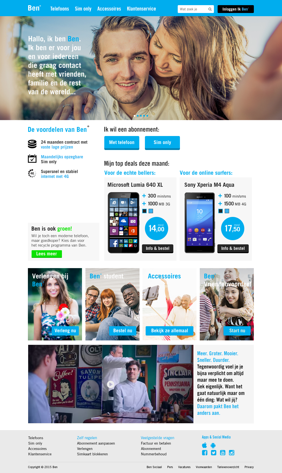
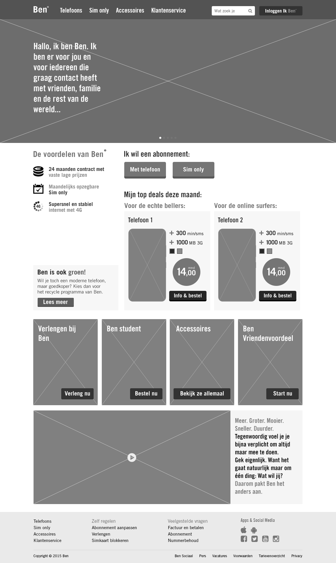
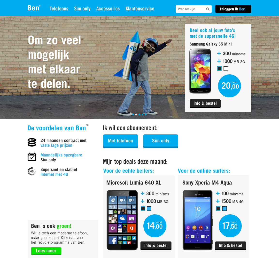
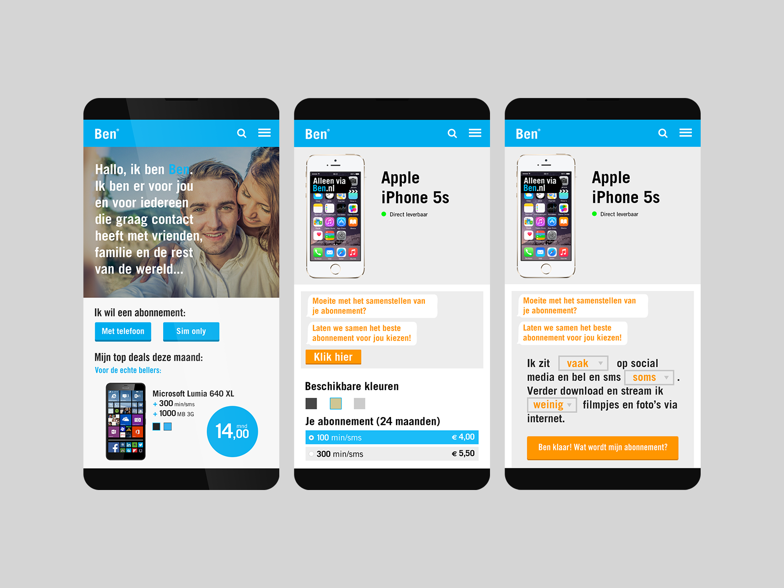
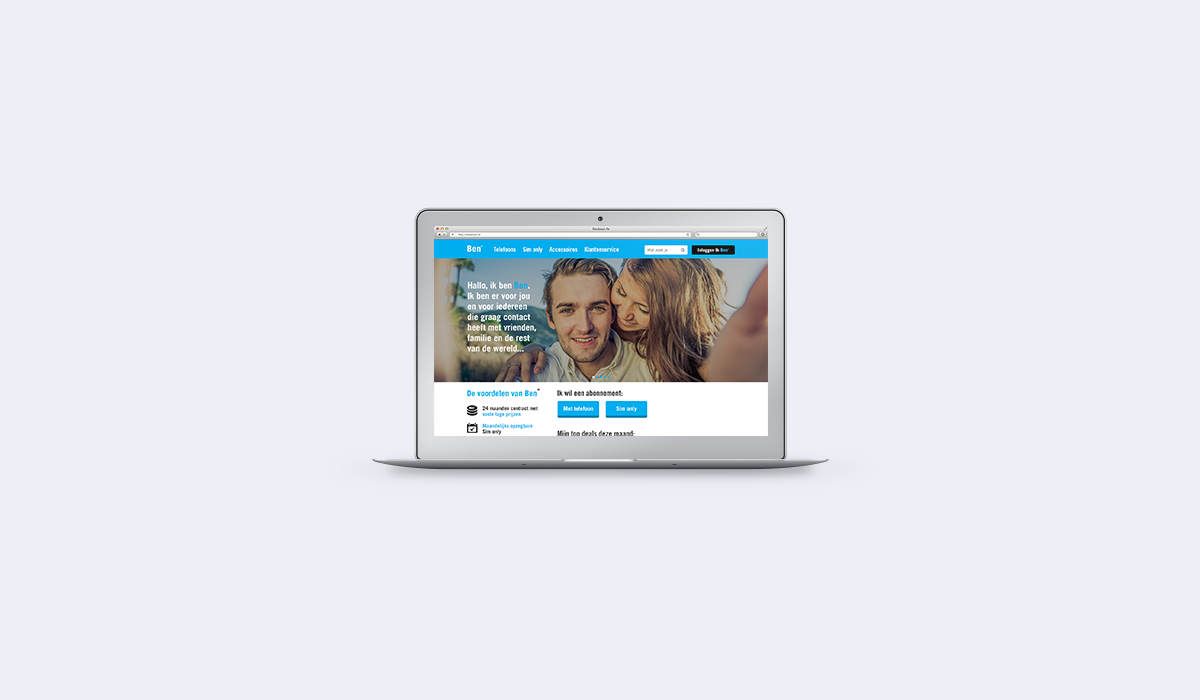
Homepage
The homepage uses storytelling in the form of a slider. The user can choose if he/she wants a phone or sim only. The top deals of the current month are shown.
More images
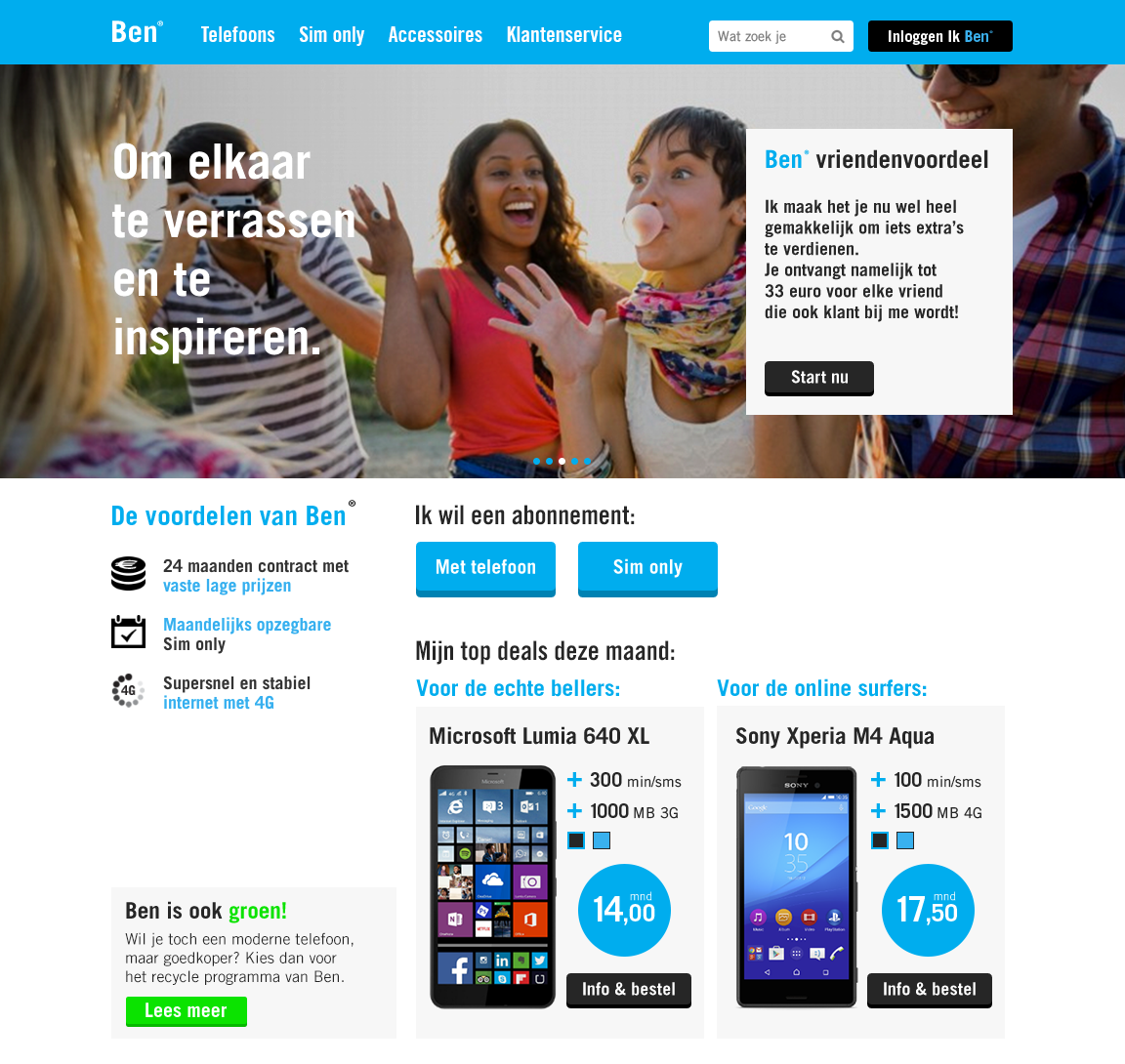
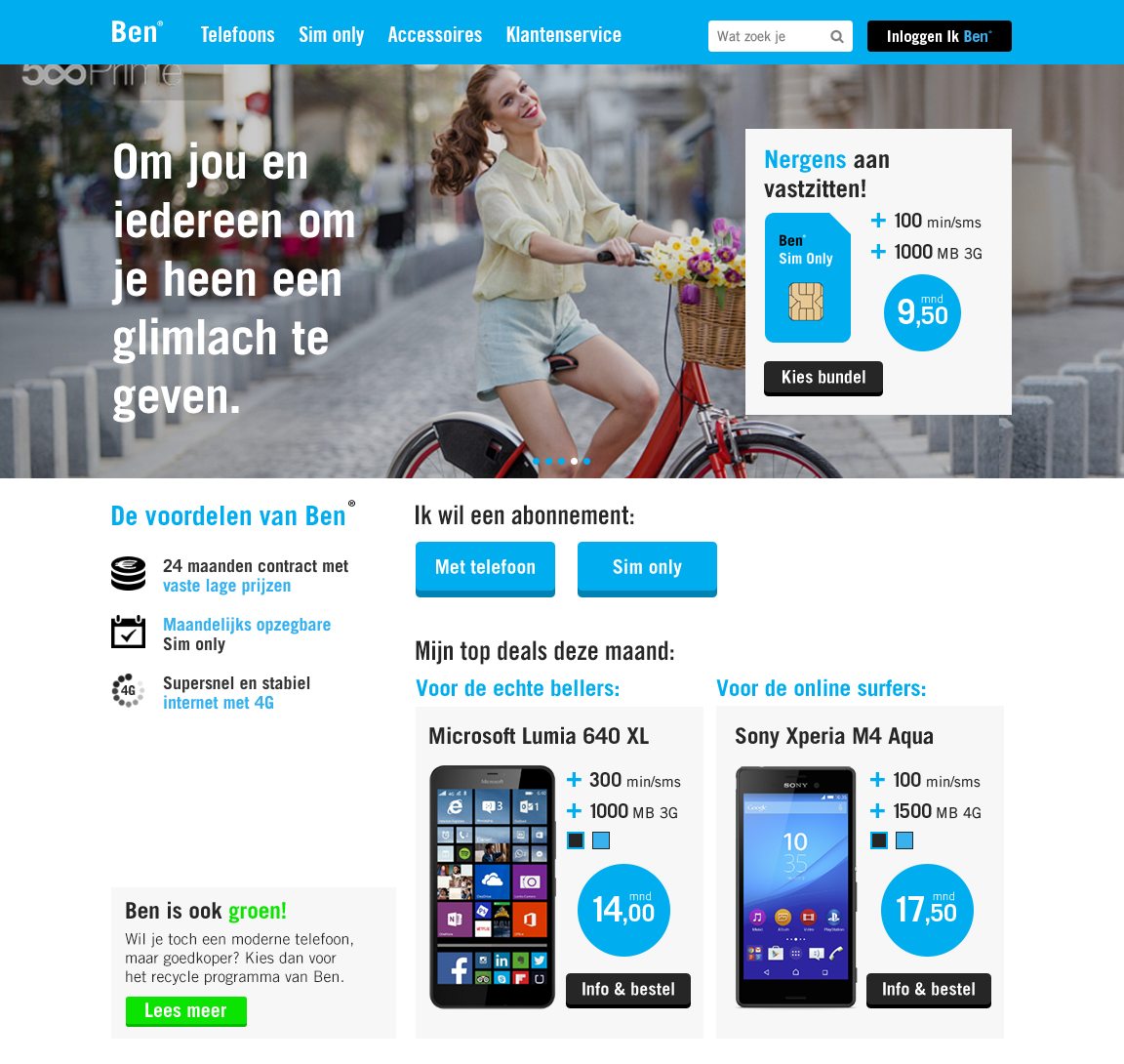
Storytelling
In the slider, which makes use of storytelling (to adress the user personally) different deals are shown which the user can click on.
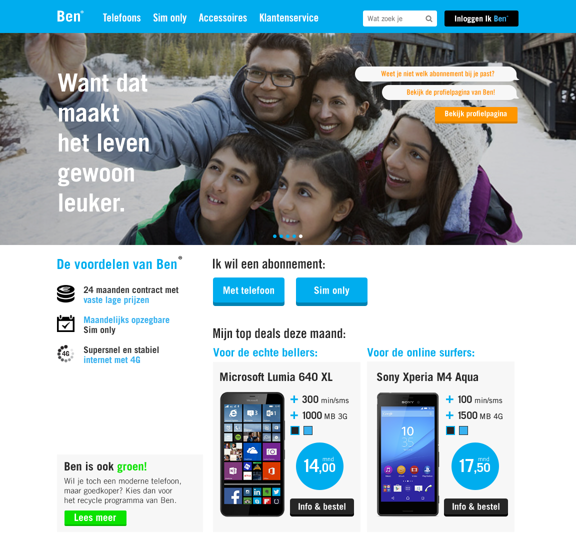
Personal profile
The user is able to check which profile fits with him/her. This profile is linked to a fitting mobile phone and subscription.
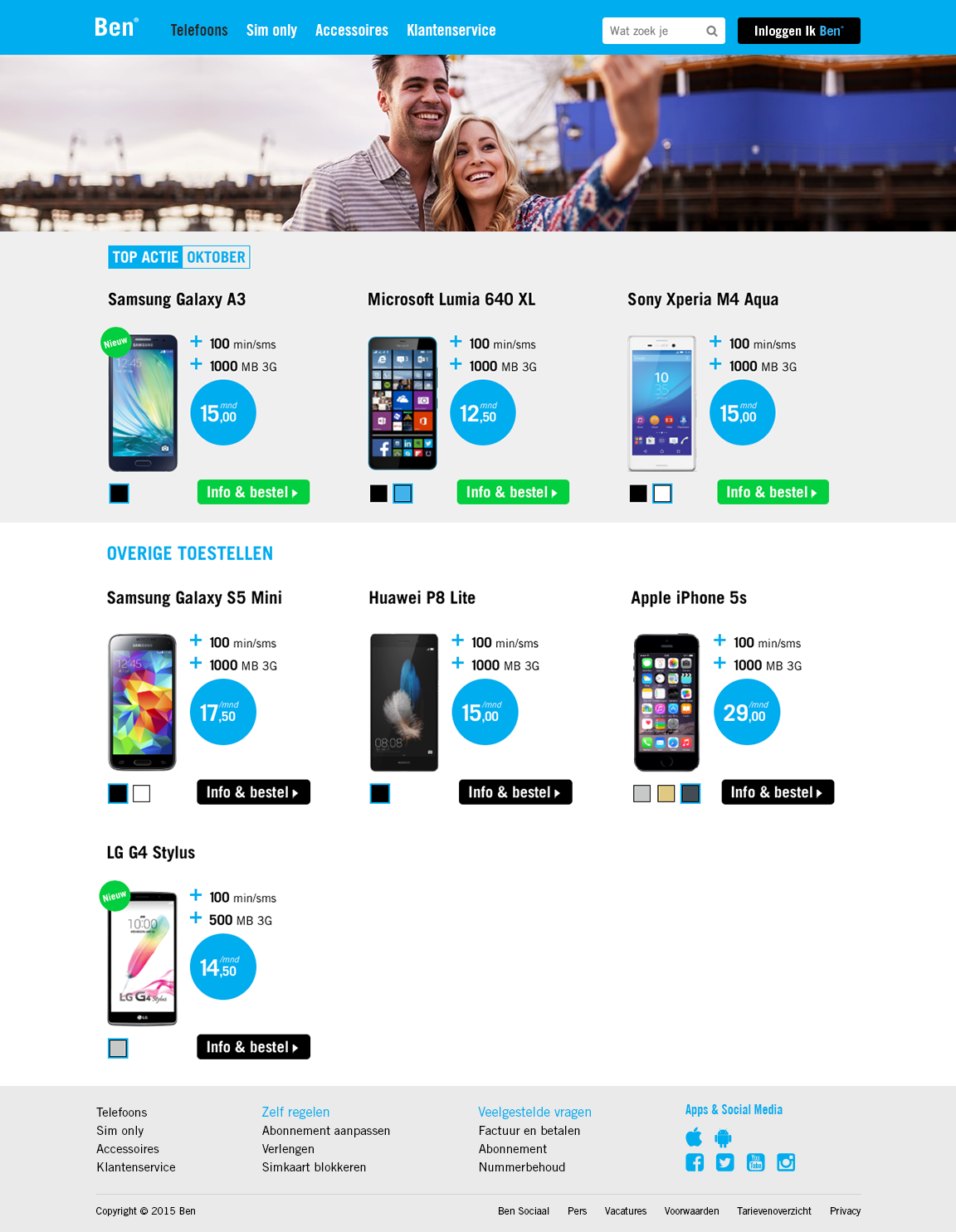
Phones
The current deals of the month are shown. The user can browse through different phones, select them by price, color, etc.
More images
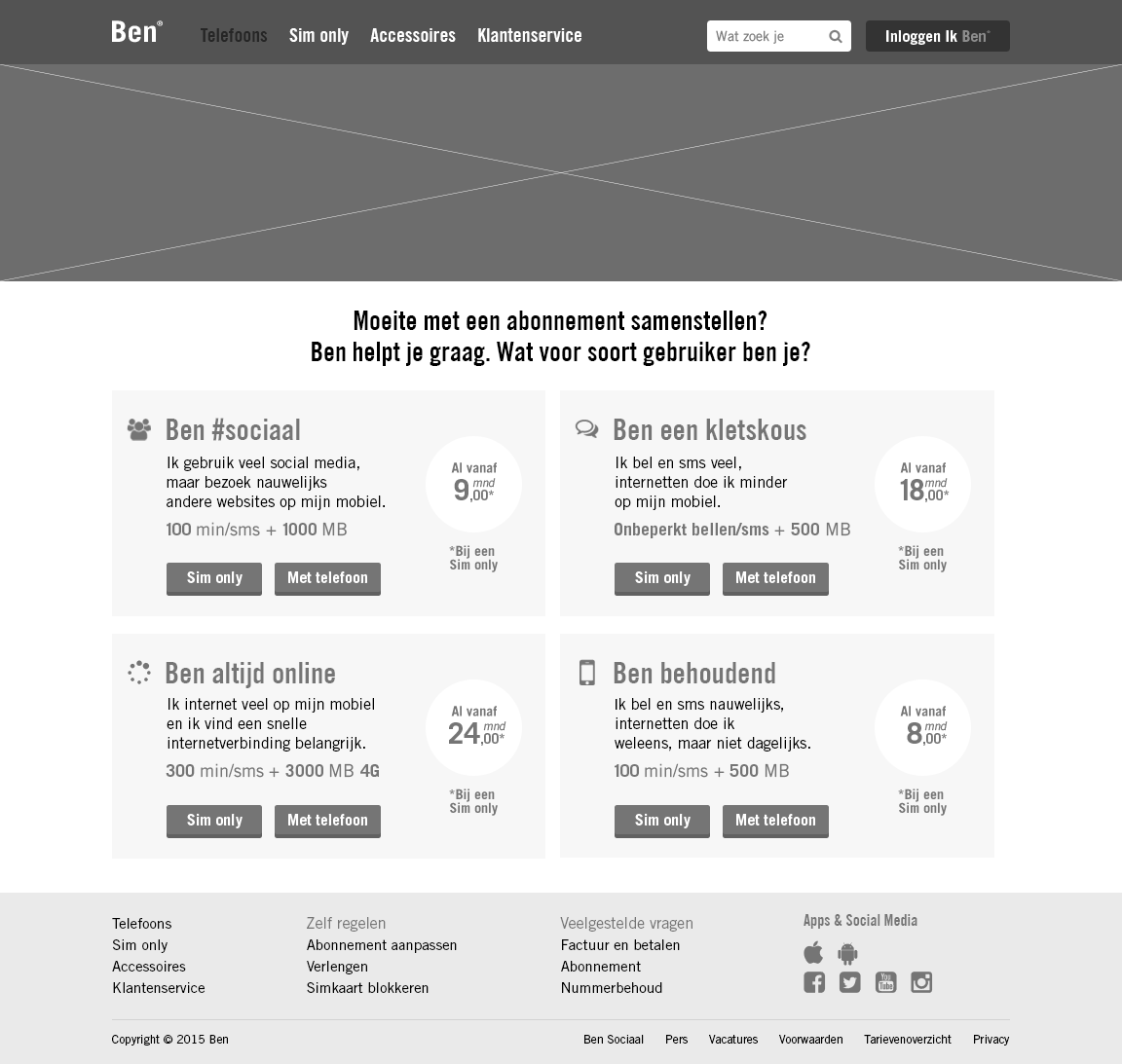
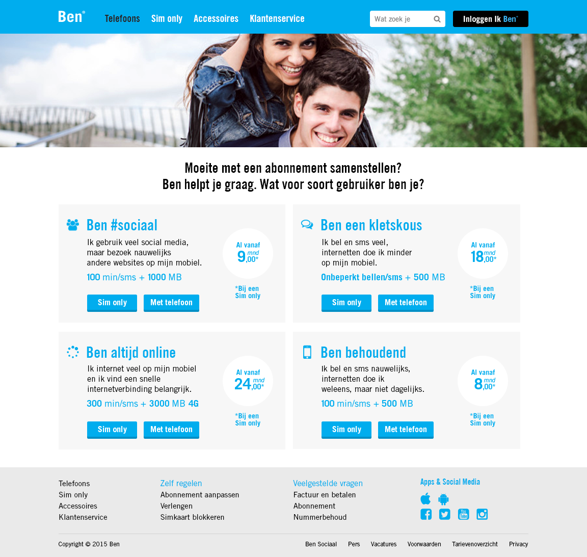
Help with subscription
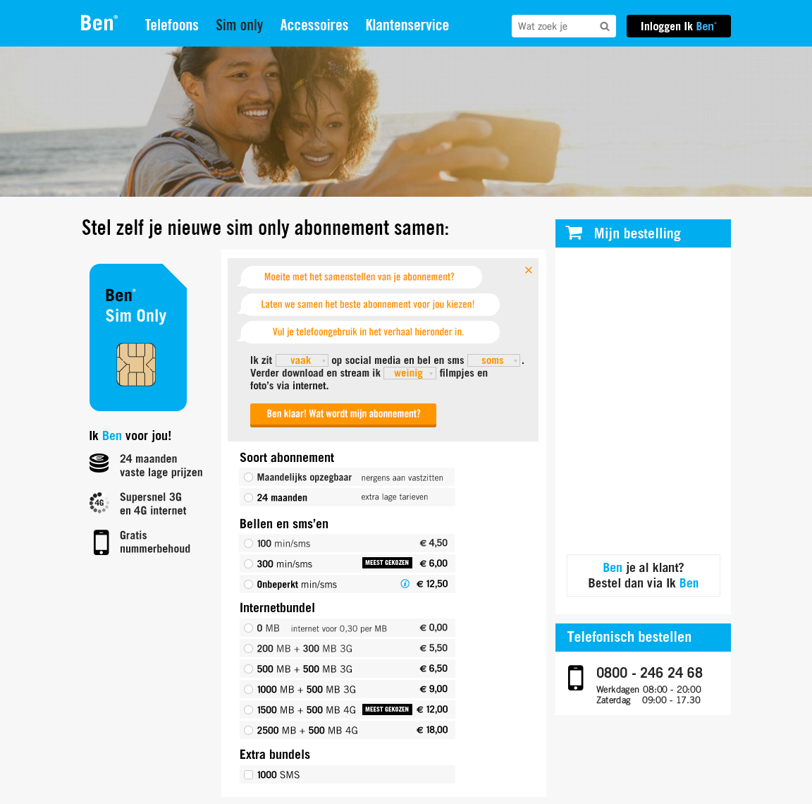
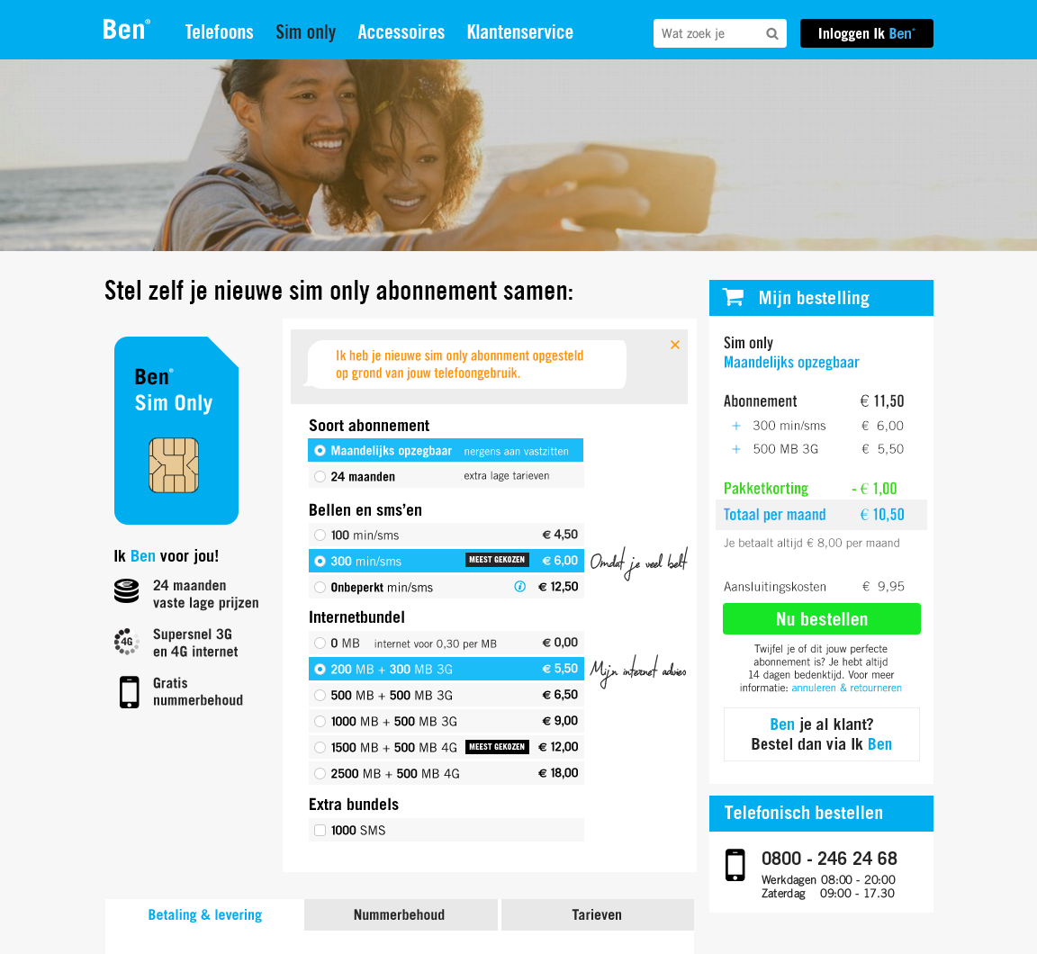
In case the user has a difficulty in choosing a subscription, he/she can fill in a form that links a fitting subscription to preferences.
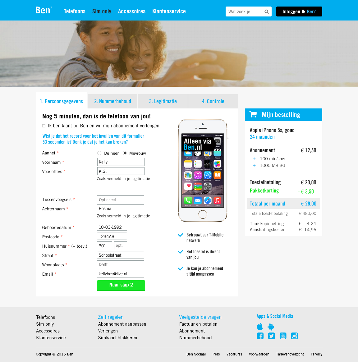
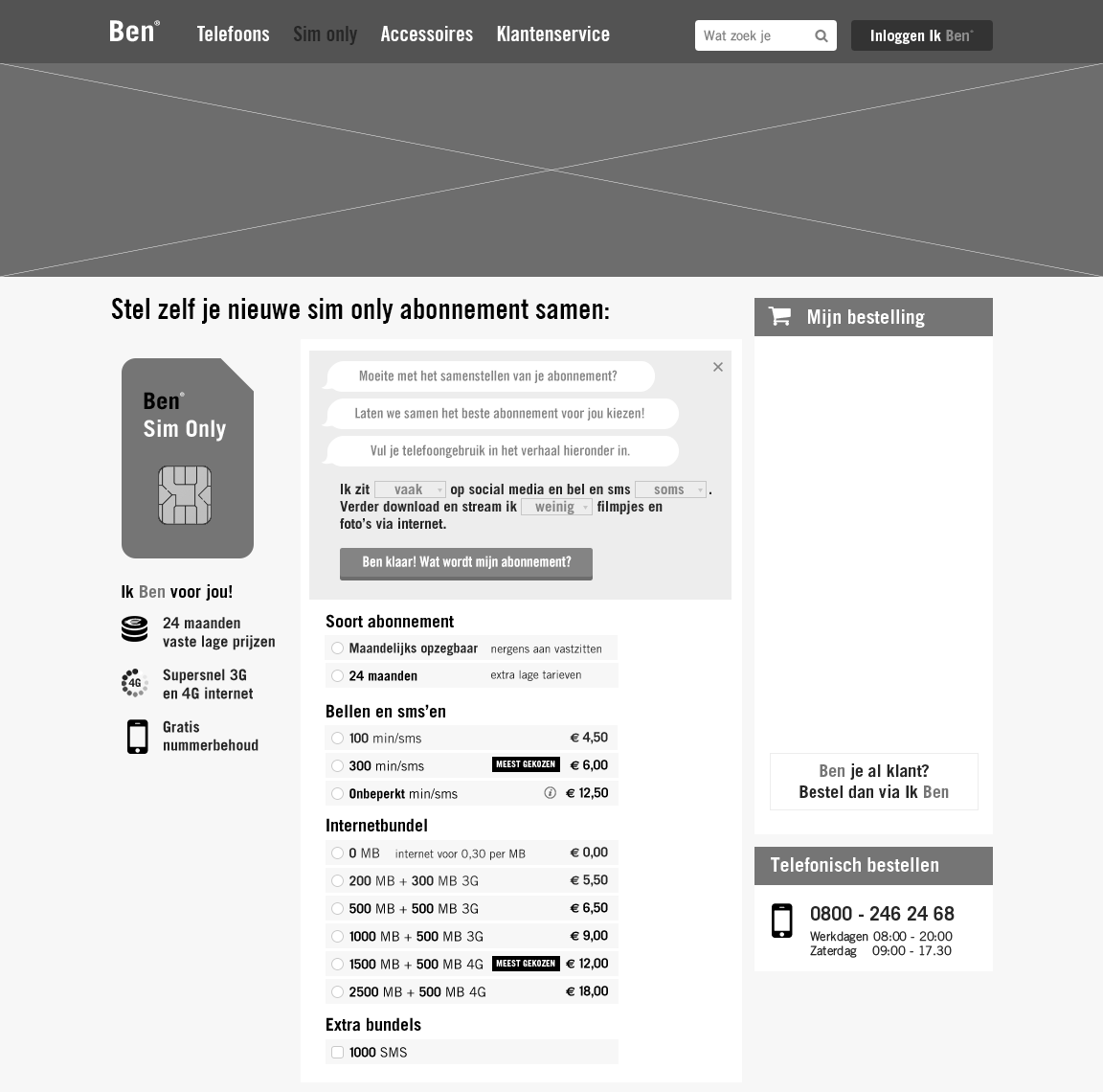
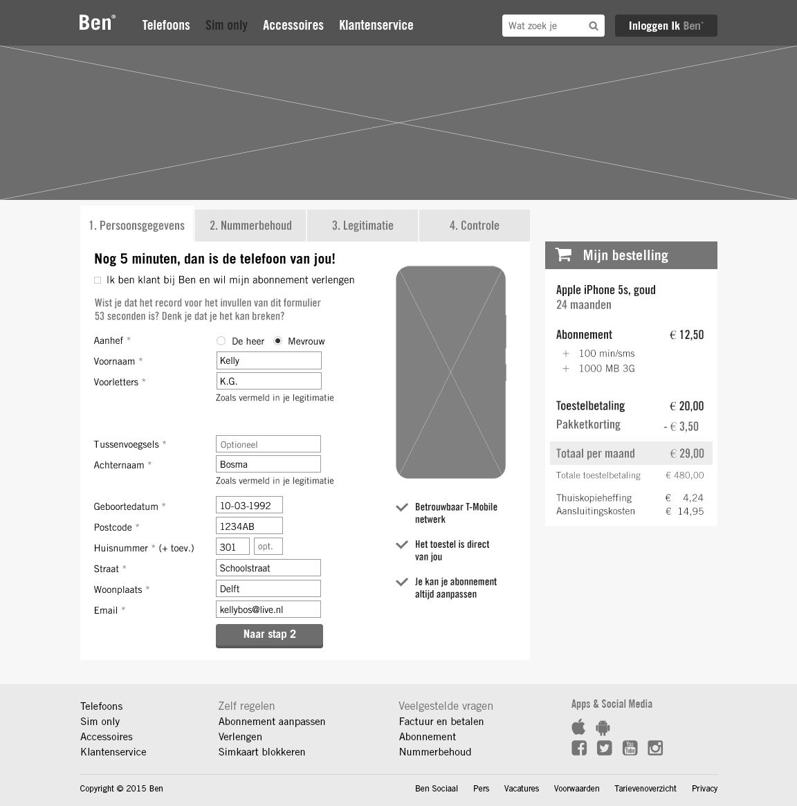
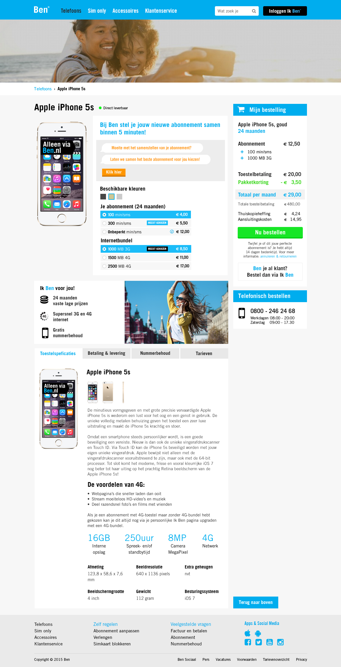
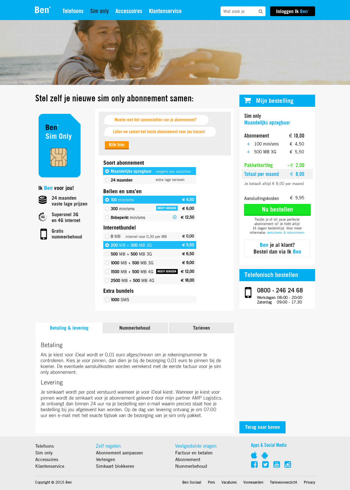
Ordering process
The first step of an ordering process of a telephone. The form has a informal approach. For instance, it asks the user if he/she can break the current record of filling in the form, which is 53 seconds at the moment.
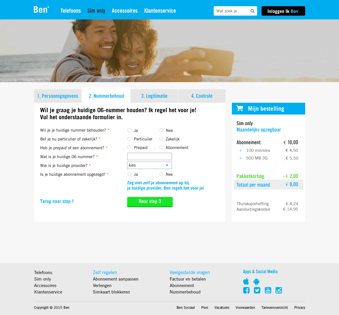
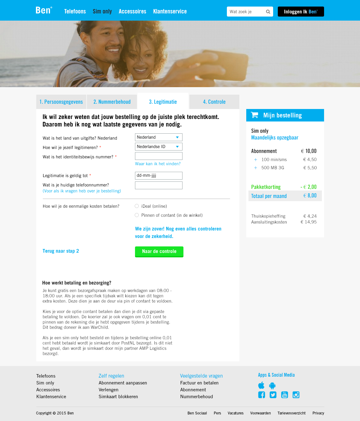
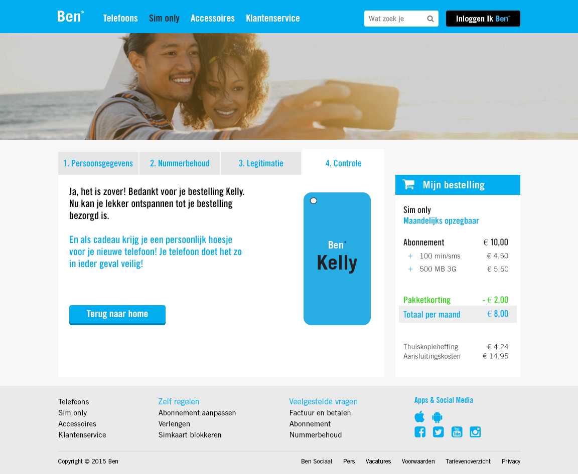
New ordering process
Above, the second (number portability), third (identification) and last step (control) of the ordering process of a telephone / a subscription are shown.
Showcases
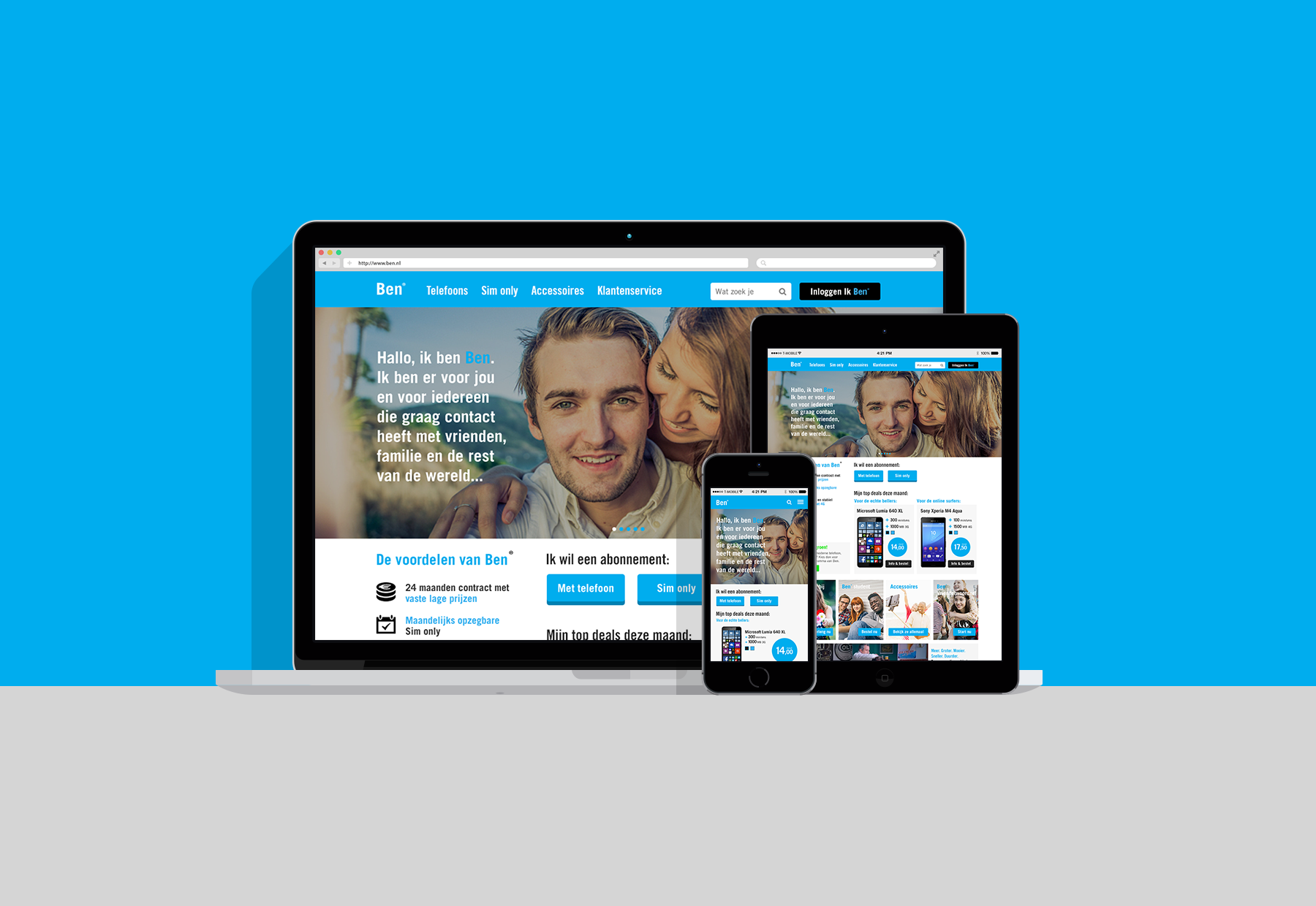
The clickable hi-fi prototype can be viewed on desktop, tablet and mobile, as is shown in both of these showcases.
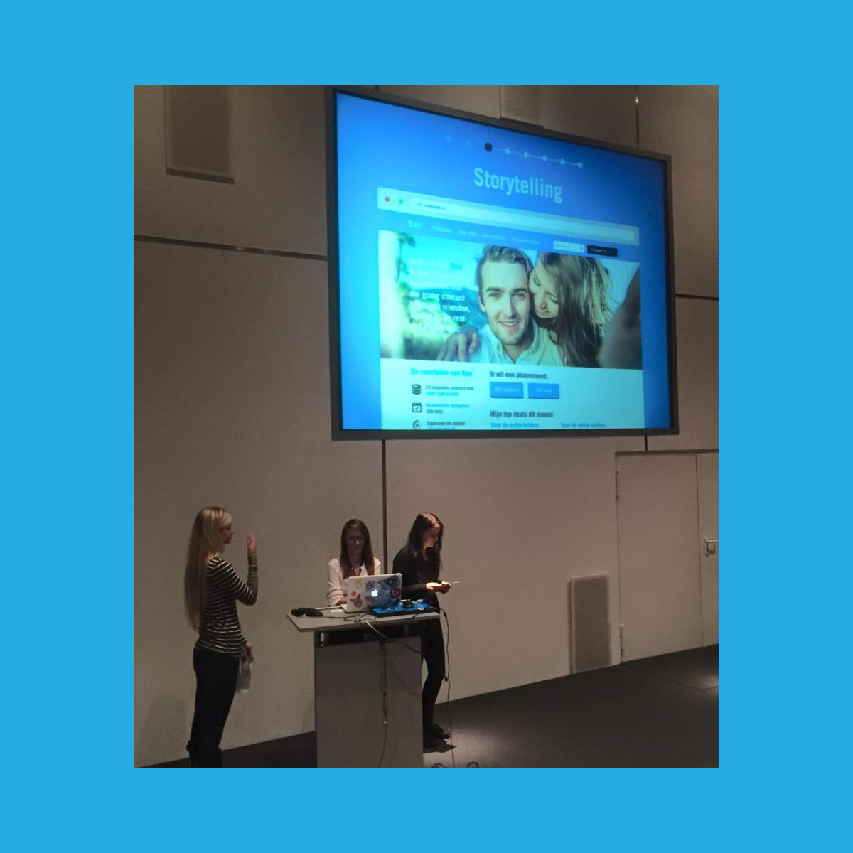
Final presentation
At the end of the project we presented the final product to the people of Ben and T-Mobile (I’m standing on the right).
6. Evaluation phase
The evaluation phase consisted of the evaluation of the process and the evaluation of the products.
Ben experience
The final product of this project was – in the form of a prototype and an advisory report – presented to Ben.