
Client: VeganChallenge (Nederlandse Vereniging voor Veganisme)
Project: Designing a lo- and hi-fi prototype of a mobile application for (the participants of) the VeganChallenge
Process: 1. Research, 2. Plan, 3. Design, 4. Prototype, 5. Test, 6. Deliver and 7. Improvement
Tools: Paper Prototyping, Adobe Photoshop, Adobe Illustrator, Marvel App
Result: Interactive prototype, documentation, presentation at VeganChallenge

1. Summary
The VeganChallenge is growing fast: more and more people participate several times a year. Besides offering information on the website, the VeganChallenge wants to offer an app to the participants. During more than two months I was busy with designing a lo- and hi-fi prototype. The final result was used as version 1.
Role: During this project I was the only designer in the team and worked independently. I organised co-creation sessions with multidisciplinary designers in my network on moments I wanted feedback on my process and product. After the project both sides enthusiastically decided to develop and realize the VeganChallenge app.
Situation: The VeganChallenge is a project of the Nederlandse Vereniging voor Veganisme (Dutch Society for Veganism, the largest Dutch organisation in vegan outreach) with the aim of making it as easy as possible to eat vegan for as many people as possible. Three times a year (in January, April and October) a challenge starts. With the slogan ‘Challenge yourself!’ the VeganChallenge literally is a challenge which participants take themselves. Besides offering information via the website the VeganChallenge wants to offer a mobile application for their participants.
Challenge: It will be a challenge to convert essential aspects of the website to a mobile application. It really has to be a mobile application and not a convertion to a mobile website.
Goal: To be able to see a complete clickable hi-fi prototype on a mobile phone at the end of the project to get a good impression on how the VeganChallenge app might look ‘for real’.

Main question
How can I translate a website to a mobile application which is based on context-awareness, with the main purpose to get as many participants of the VeganChallenge as possible and as a secundary purpose to let these participants make use of this mobile application as much as possible?
Sub questions:
1. What are the differences between the website and the VeganChallenge app? 2. What has to be the focus of the VeganChallenge app? 3. Which elements must the VeganChallenge app contain? 4. Which elements must the VeganChallenge app most definitely not contain? 5. How can I make sure that participants of the VeganChallenge will not uninstall the VeganChallenge app after the challenge?
VeganChallenge
The VeganChallenge: Yearly, in April and October, participants are supported with recipes and weekly menus, tips and tricks, a personal dietary advice and an online community.

2. Research phase
The research phase consisted of researching the target group, analysing the target group, researching the organisation, researching competition, drafting business needs, researching the website versus the app, creating a conceptual scenario and creating a context-analyse.

Survey
To get an insight in the expectations of the target group, I created and send out a survey to the present participants of the VeganChallenge. The survey was placed on Facebook.
Target group
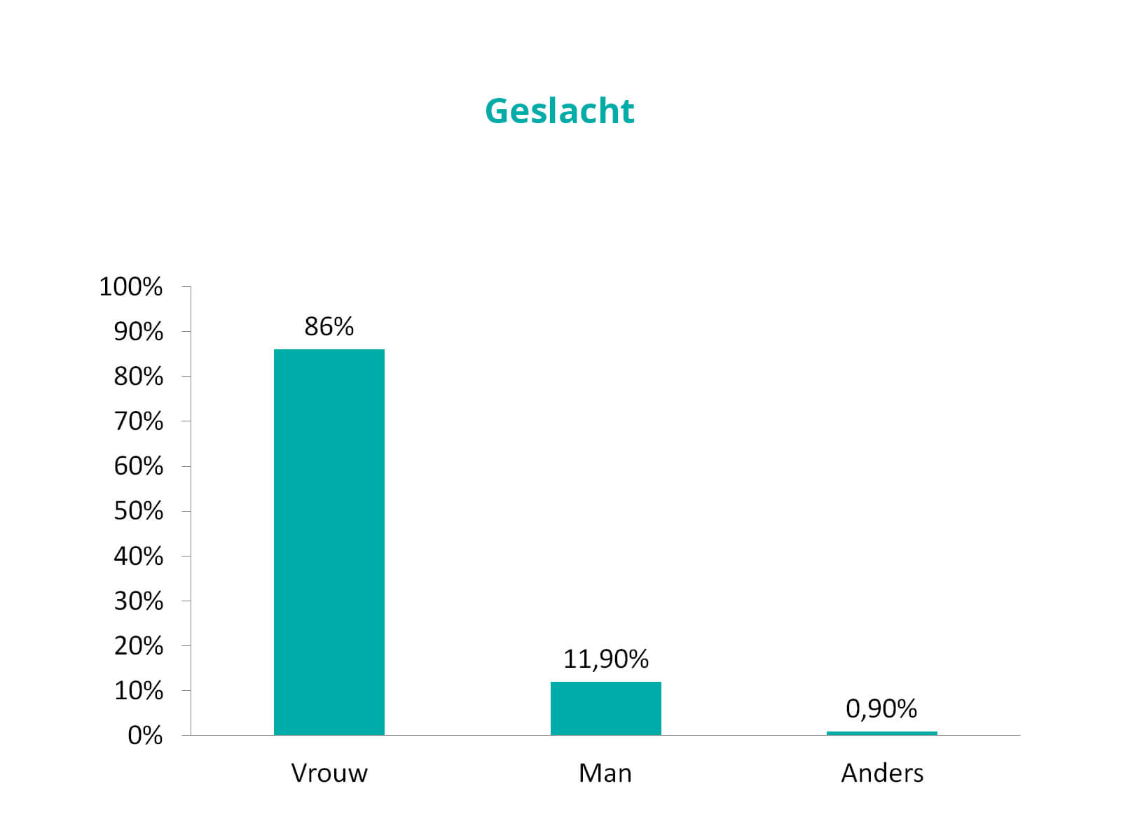
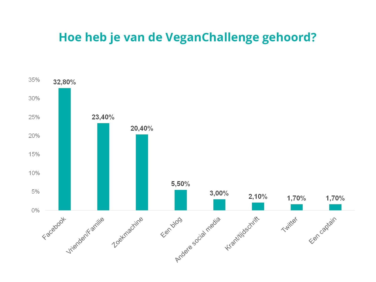
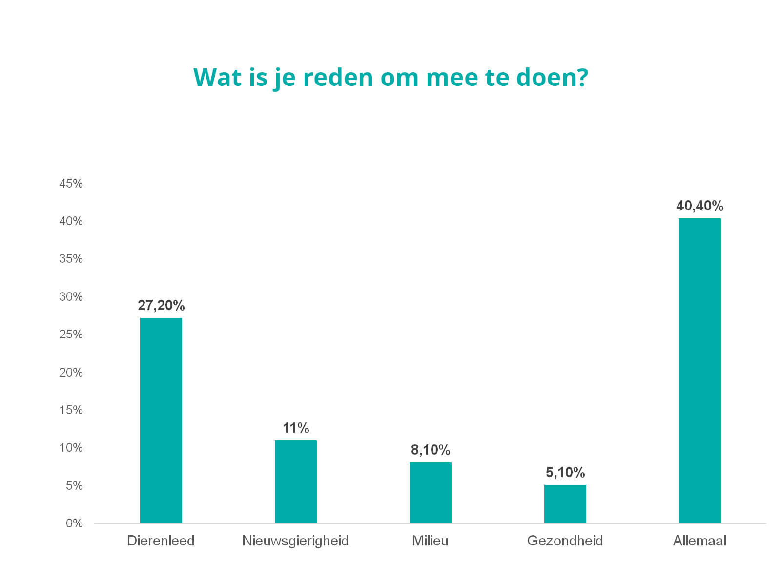
More than 80% of the respondents is female, over 30% got into contact with the VeganChallenge via Facebook and over 40% participated in the VeganChallenge because of animal suffering, out of curiosity, the environment and their health.
Core values
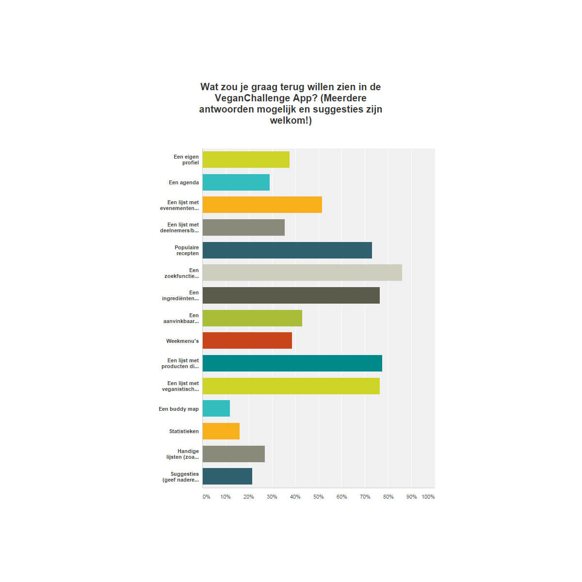
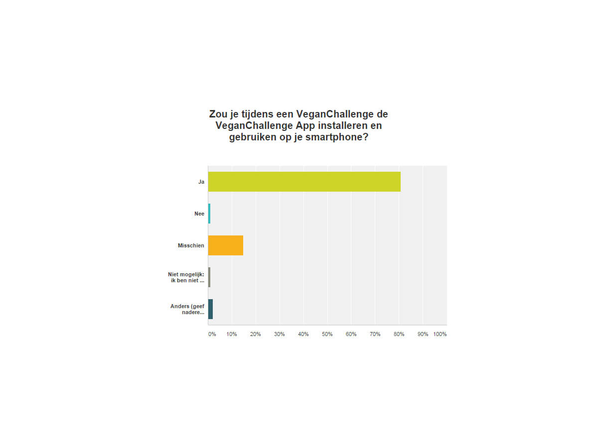
More than 80% of the respondents would install and use the VeganChallenge app during the VeganChallenge. Core values: motivation, stimulation, inspiration, communication, simplicity, interaction, on the go, information.

More images
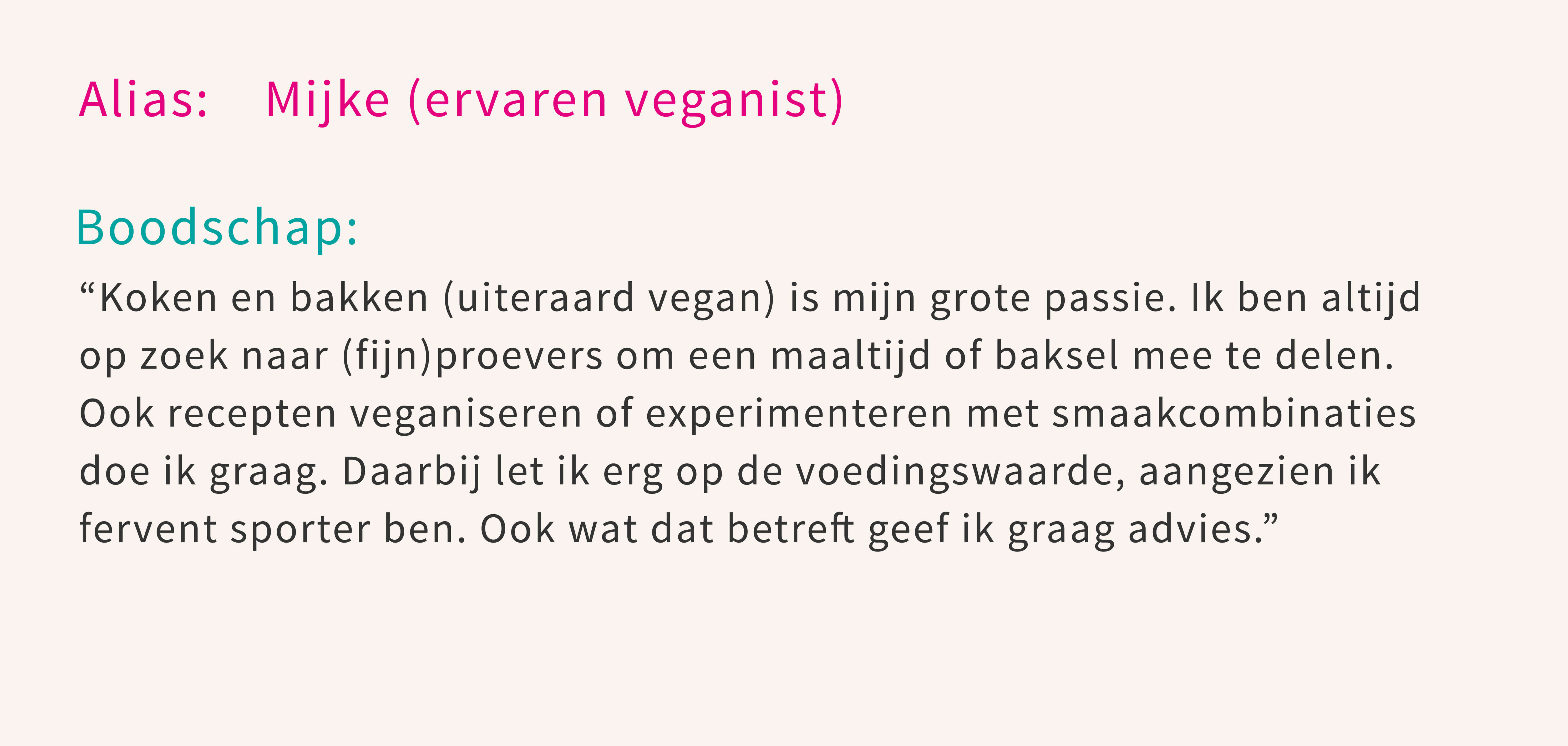


Personas and profiles
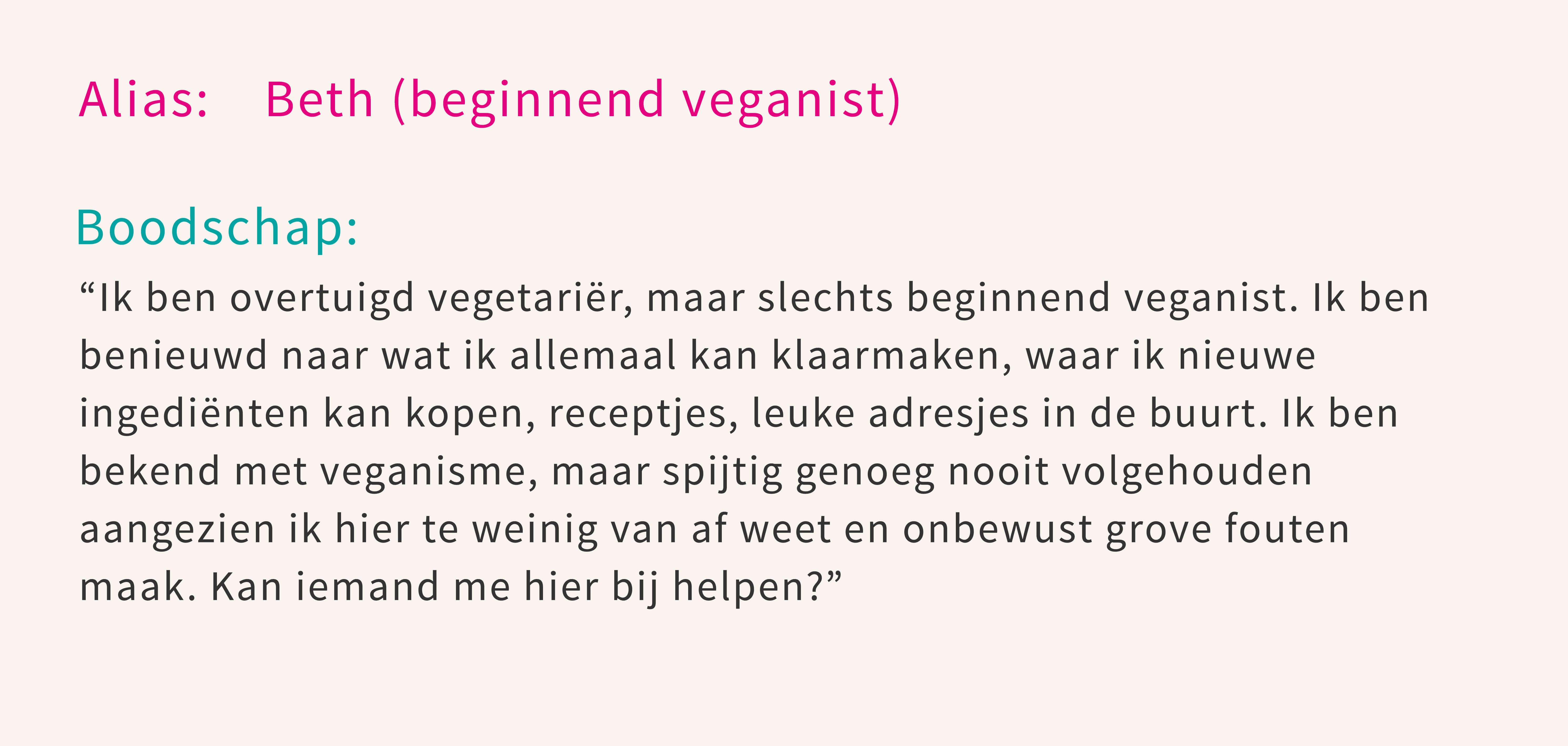
There are several kinds of participants of the VeganChallenge with different user needs. Participants mainly have the need for motivation, stimulation and inspiration (information). Also, they would like to get in contact with other participants and exchange tips and ideas (communication).

3. Concept phase
The concept phase consisted of creating app options, creating app concepts and choosing a concept.
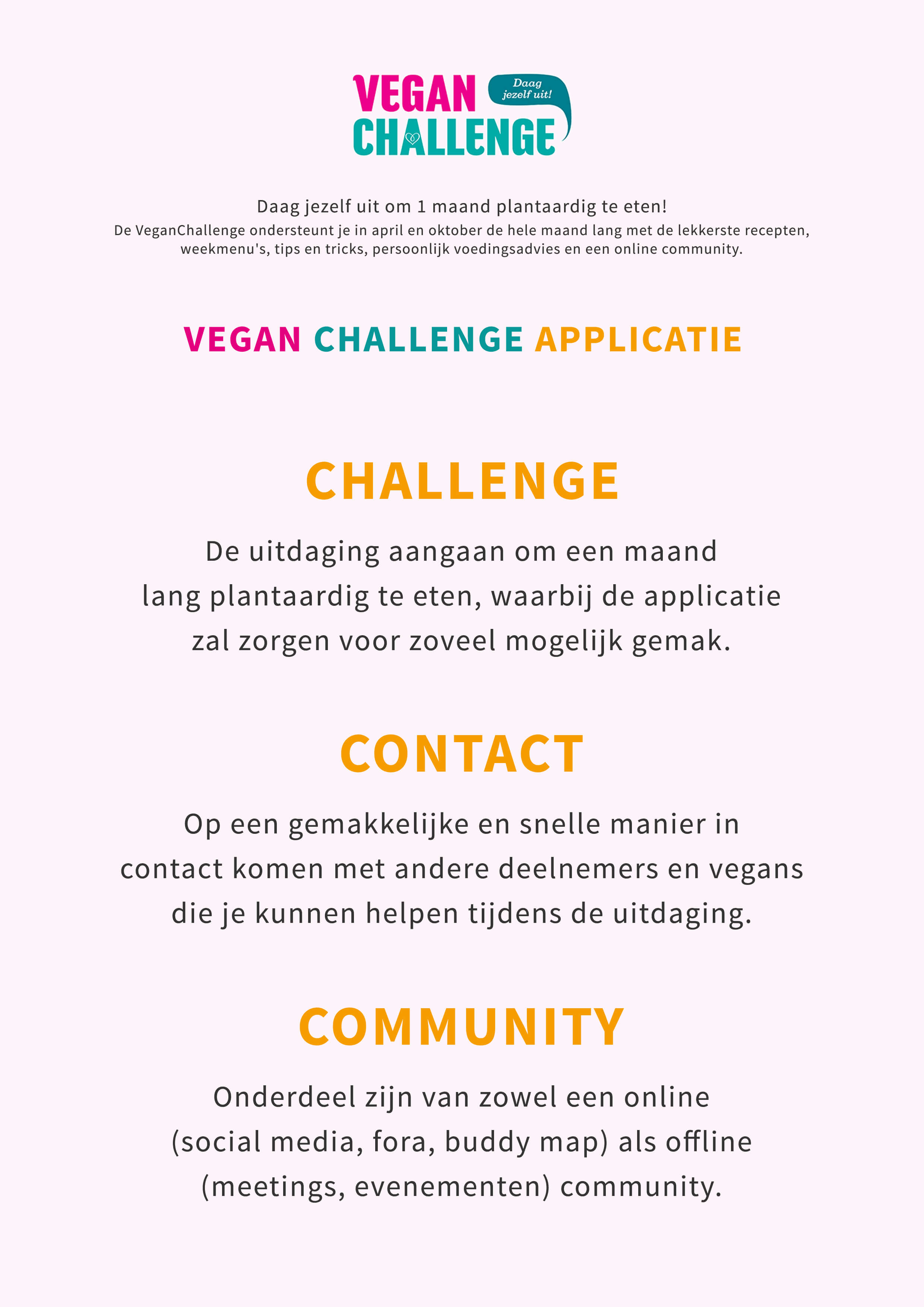

Concepts
The first concept mainly fulfills the need for information, the second concept the need for communication. After brainstorming about the options we choose the first concept, in which the second concept will be extended in later versions.

4. Design phase
The design phase consisted of designing a paper prototype, designing a lo-fi prototype and testing the lo-fi prototype with the target group.

More images


Sketches
Prior to creating the lo-fi prototype I created several sketches in mockups and created a paper prototype. In co-creation sessions with the client, the target group and and colleague designers I brainstormed about the process and the product.

More images

Lo-fi prototype
After the co-creation sessions I converted the sketches to a lo-fi prototype. I made it clickable for desktop and mobile.
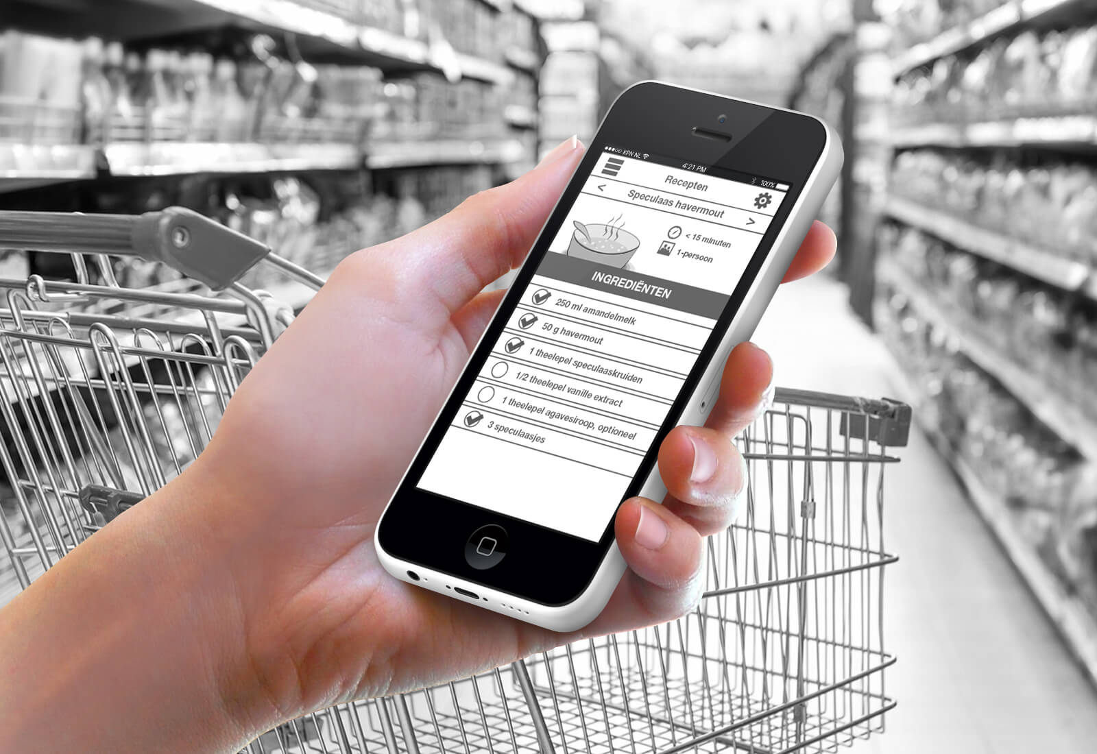
Usability test
The lo-fi prototype was tested by the target group. I received feedback which I converted into the hi-fi prototype.
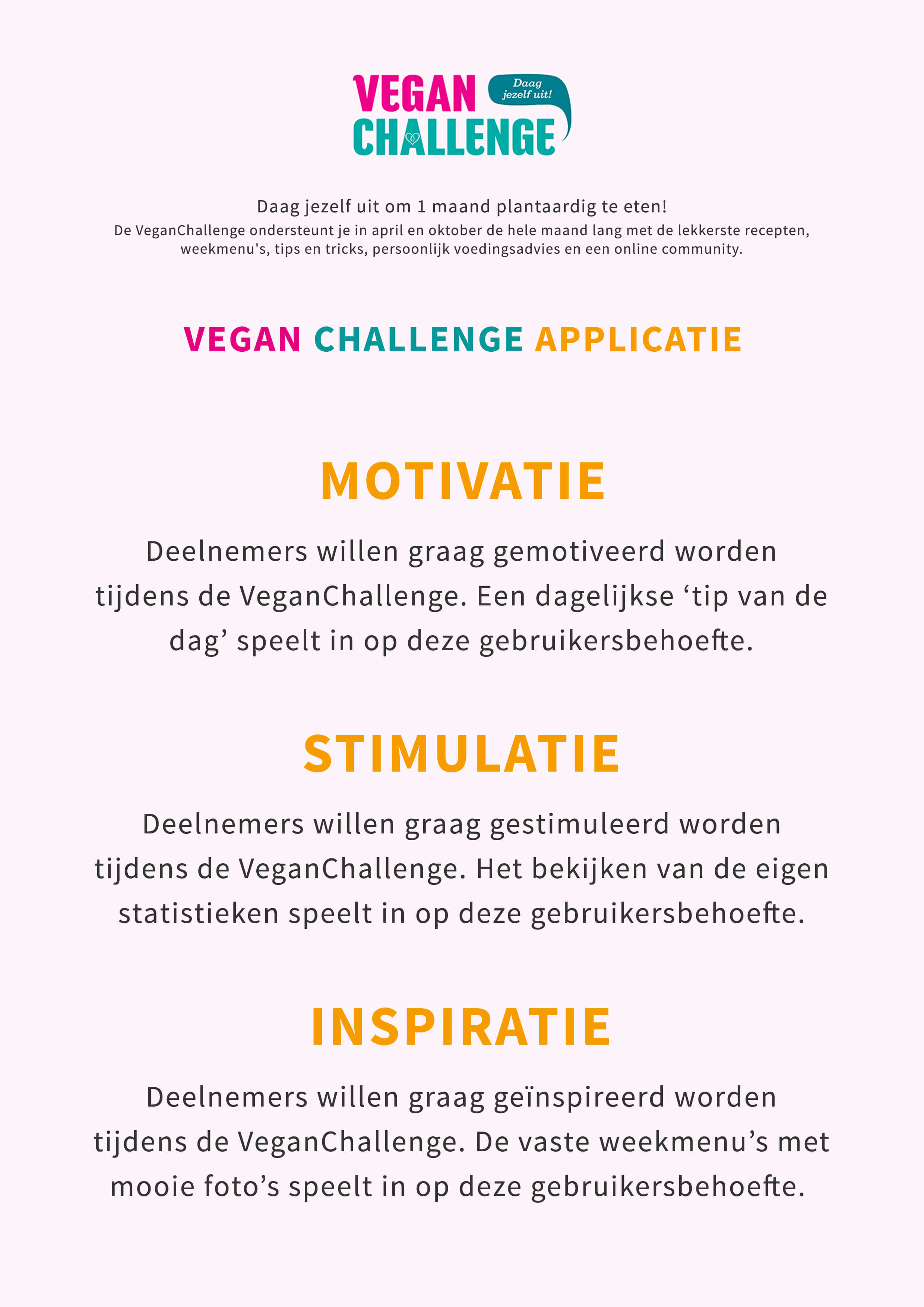
Feedback
Motivation, stimulation and inspiration: three keywords that highly emerged from the usability test and feedback.

5. Realisation phase
The realisation phase consisted of designing a hi-fi prototype and giving an advise to the client.
More images

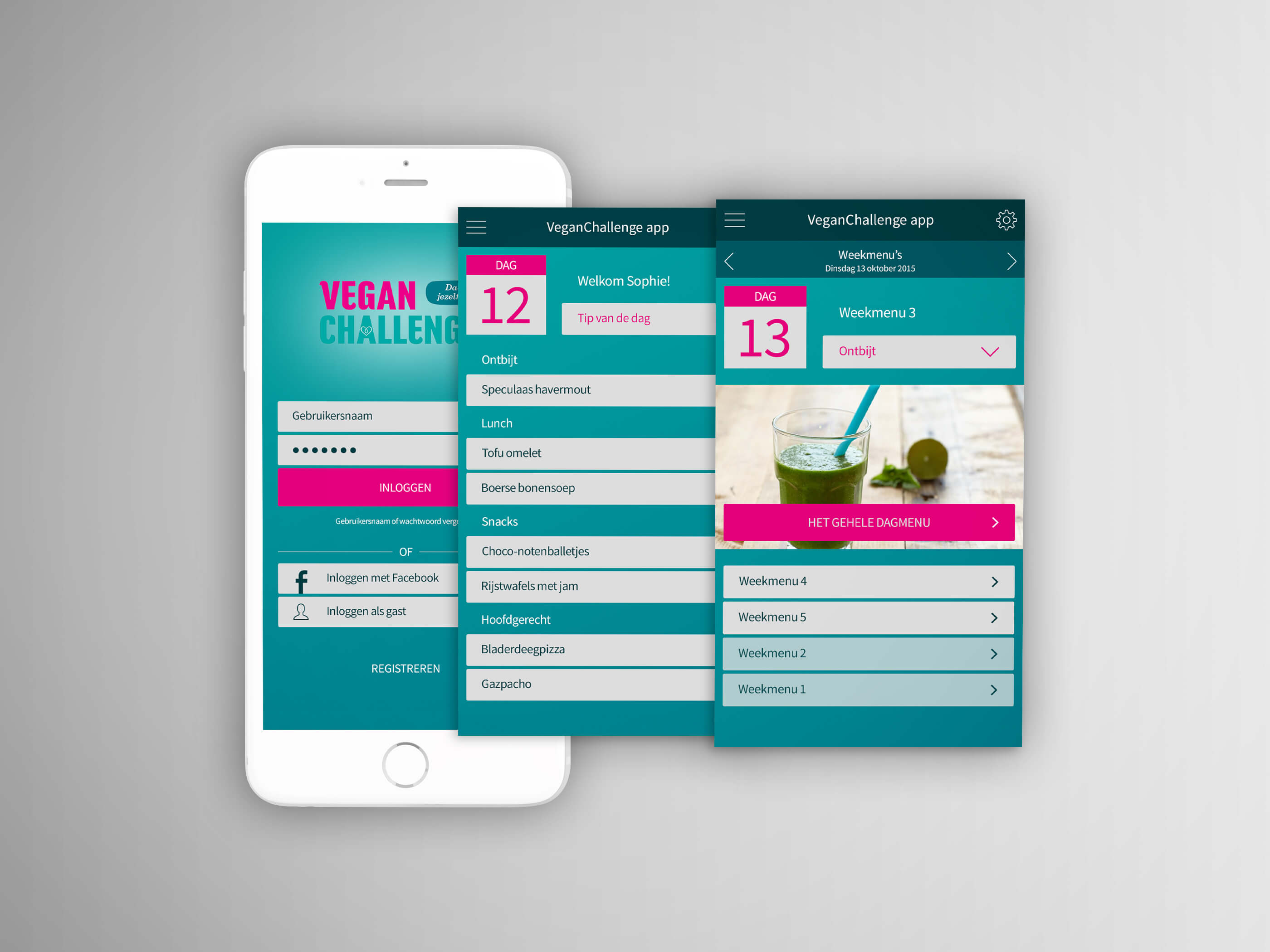
Hi-fi prototype
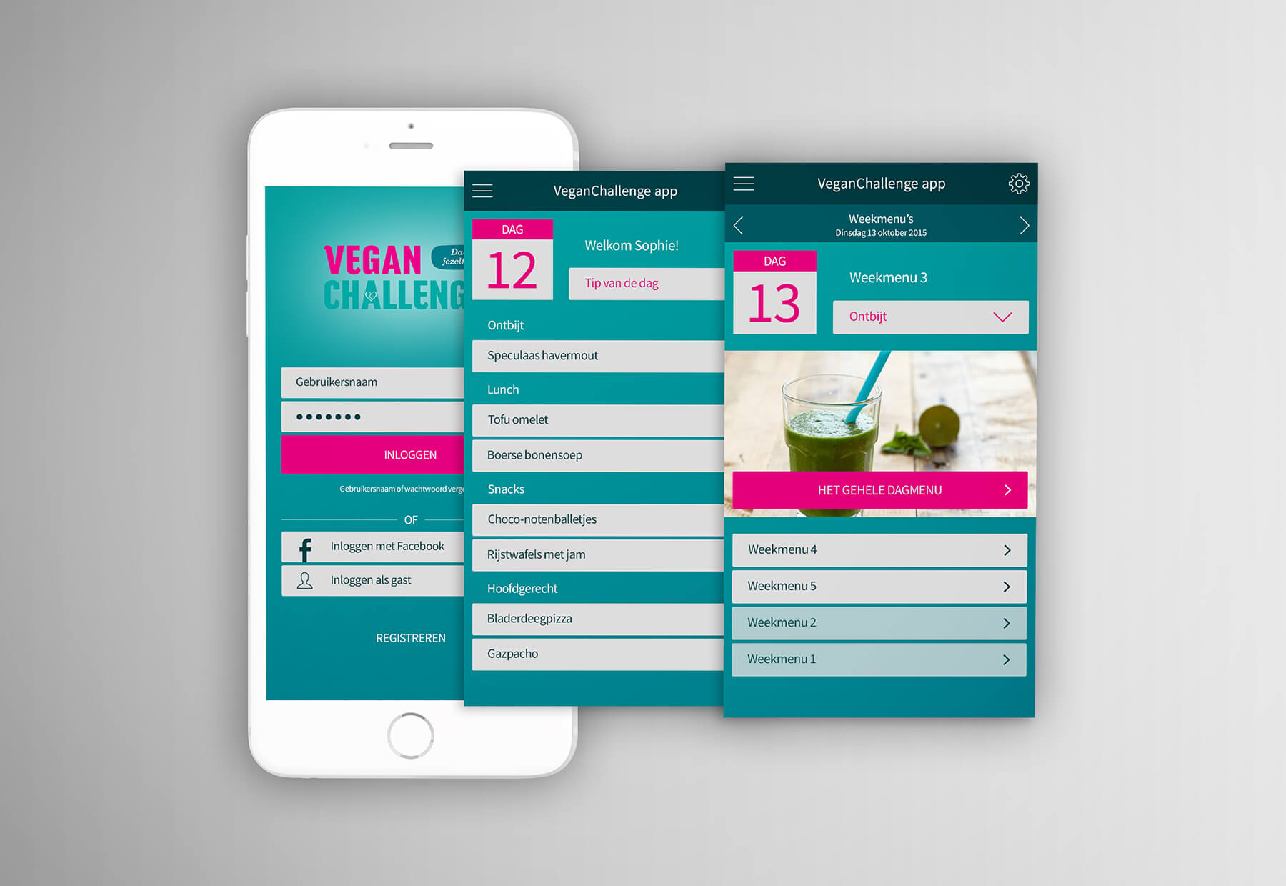
The first version of the hi-fi prototype (with adjustments of feedback to the lo-fi prototype) which I made clickable for desktop and mobile.
VeganChallenge app
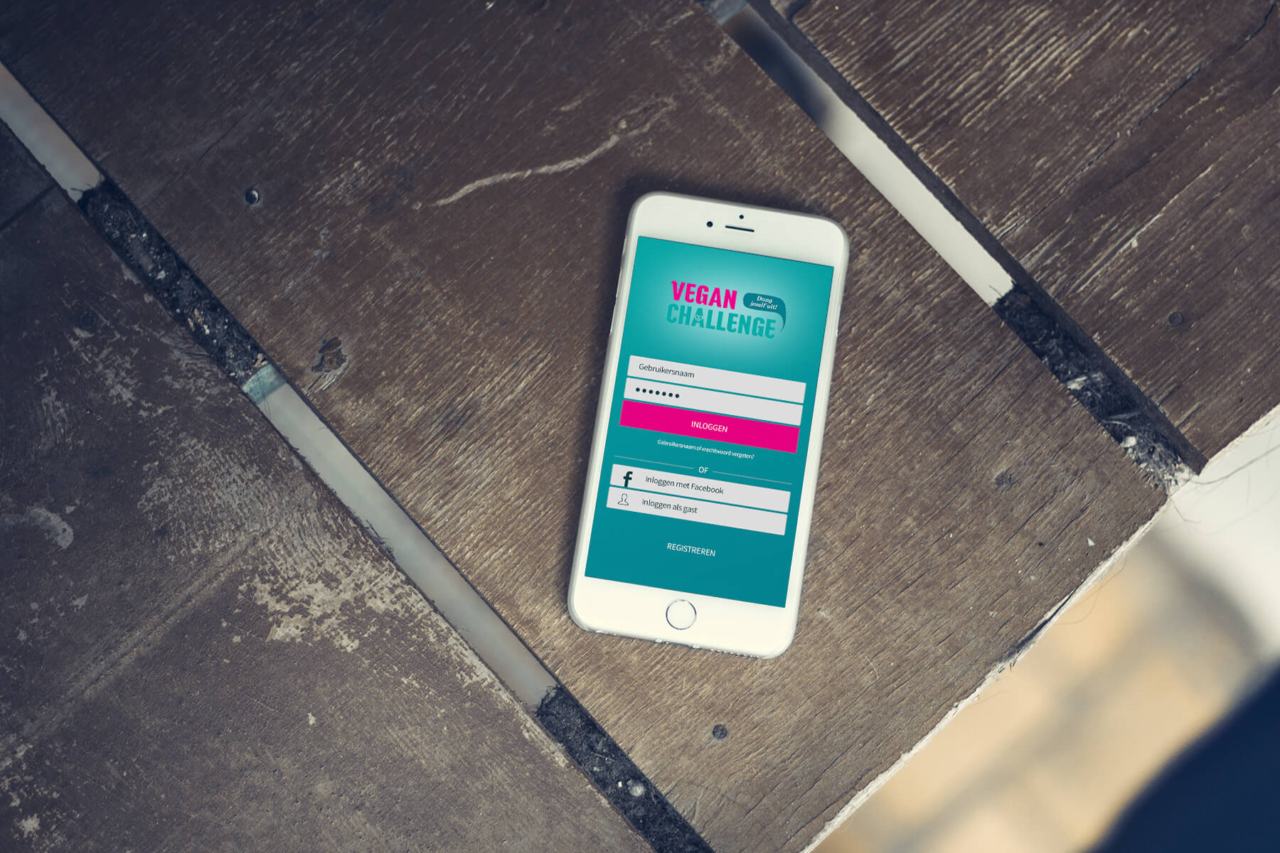
Version 1.0 of the VeganChallenge app: a complete clickable hi-fi prototype which is viewable on a mobile phone.

6. Evaluation phase
The evaluation phase consisted of the evaluation of the process and the evaluation of the products.
VeganChallenge app 2.0
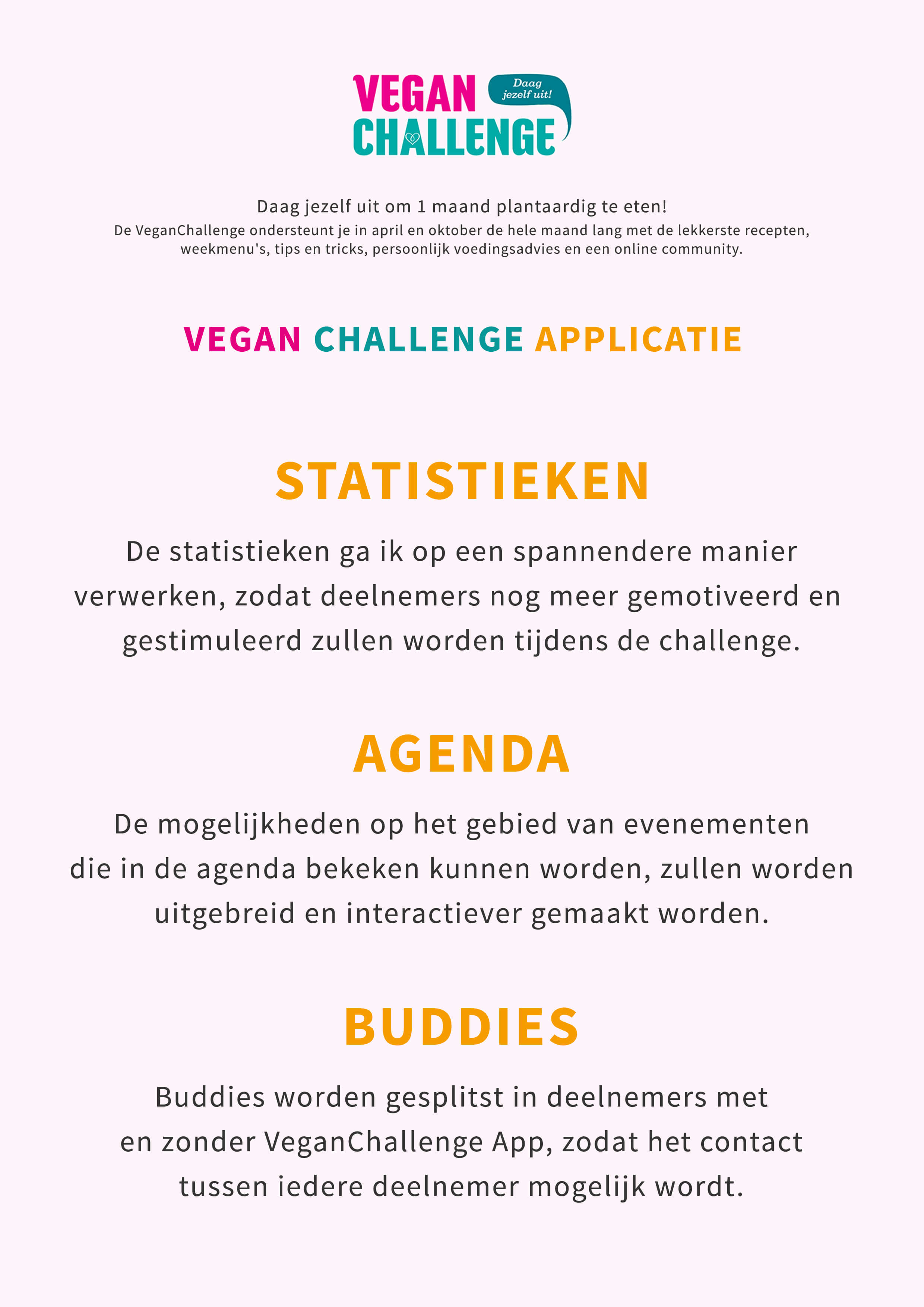
Statistics, agenda and buddies: three important attention points in the next version. Version 2.0 is in development.