
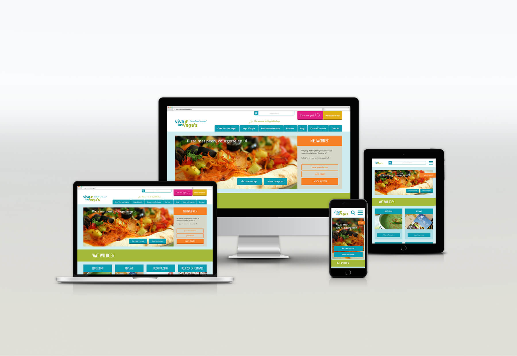
Client: Viva Las Vega’s (ProVeg)
Websites: Viva Las Vega’s (ProVeg), VeggieChallenge and VLV Food Festival
Project: Conducting a research for and designing and testing a prototype of the new website and online presence for Viva Las Vega’s
Process: 1. Research, 2. Plan, 3. Design, 4. Prototype, 5. Test, 6. Deliver and 7. Improvement
Tools: Paper Prototyping, Adobe Photoshop, Adobe Illustrator, Marvel App
Result: Interactive prototype, documentation, presentation at Viva Las Vega’s

1. Summary
The websites of Viva Las Vega’s were outdated. Viva Las Vega’s wants to create a new platform out of her three old websites. During more than five months I was busy with rebranding the online presence (corporate style and website): conducting a research and the designing of a lo- and hi-fi prototype. After my graduation Viva Las Vega’s received donation money to realize my final product.
Role: During this project, which started out as a graduation project, I was the only designer in the team and worked independently. I organised co-creation sessions with multidisciplinary designers in my network on moments I wanted feedback on my process and product.
Situation: More people want to live a healthier life. Various studies have shown that the Dutch population eats less meat. The target group of Viva Las Vega’s is getting bigger and bigger. Viva Las Vega’s’ mission is to accelerate the vegan revolution in the Netherlands. The three websites managed at the moment – the main website, the Food Festival website and the VeggieChallenge website – no longer work and also lack content: Viva Las Vega’s wants a new website.
Challenge: Viva Las Vega’s has no insight into the user needs of her target group and also does not know how to properly approach the different segments of its target group via one platform – the new website(s) – instead of via three seperate websites.
Goal: Viva Las Vega’s wants to be thé online vega platform of the Netherlands. The biggest goal of this platform – the new website(s) – is to address the needs of the different segments of the target group and to thereby carry out a warm ‘veggie’ community in which a more substainable, animal friendly and people-friendly society is promoted. The online platform has to be thé place where veggie Netherlands can get their information.

Main question
Out of which segments does the target group exist and how can the different segments of the target group be optimally being approached via one or several websites?
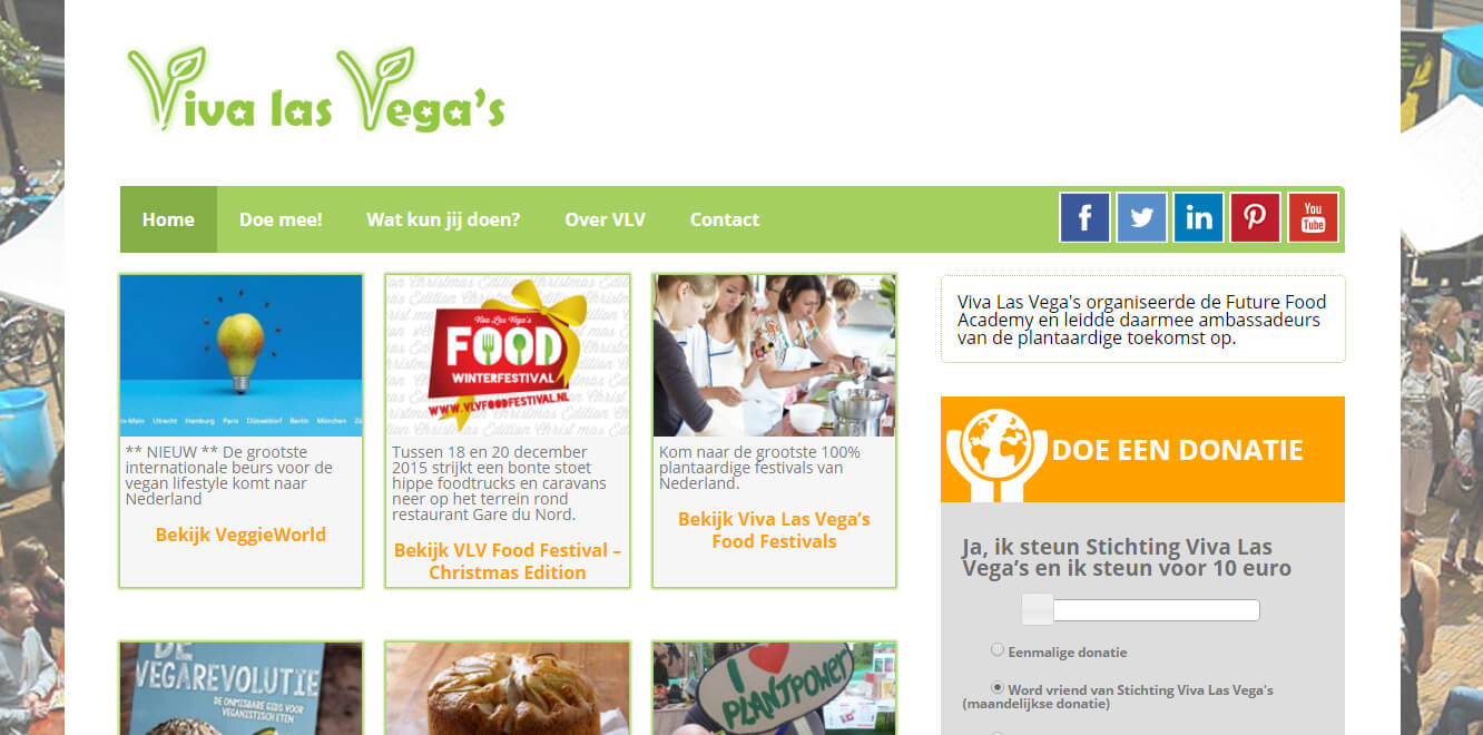
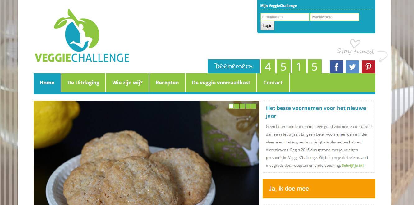
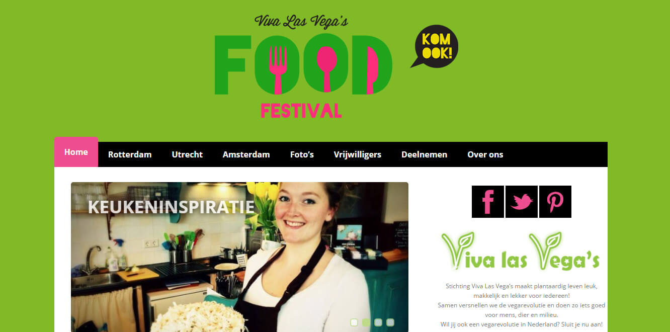
Current situation
The three websites which are managed at the moment – the main website, the Food Festival website and the VeggieChallenge website.

2. Research phase
The research phase consisted of researching the target group, analysing the target group, processing external researches, researching the organisation, researching competition and drafting business needs.
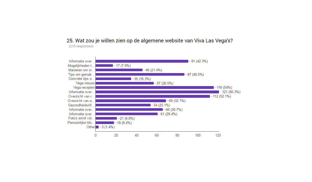
Surveys
The response to this question has given me a detailed insight in the user needs of the supporters and the target group.
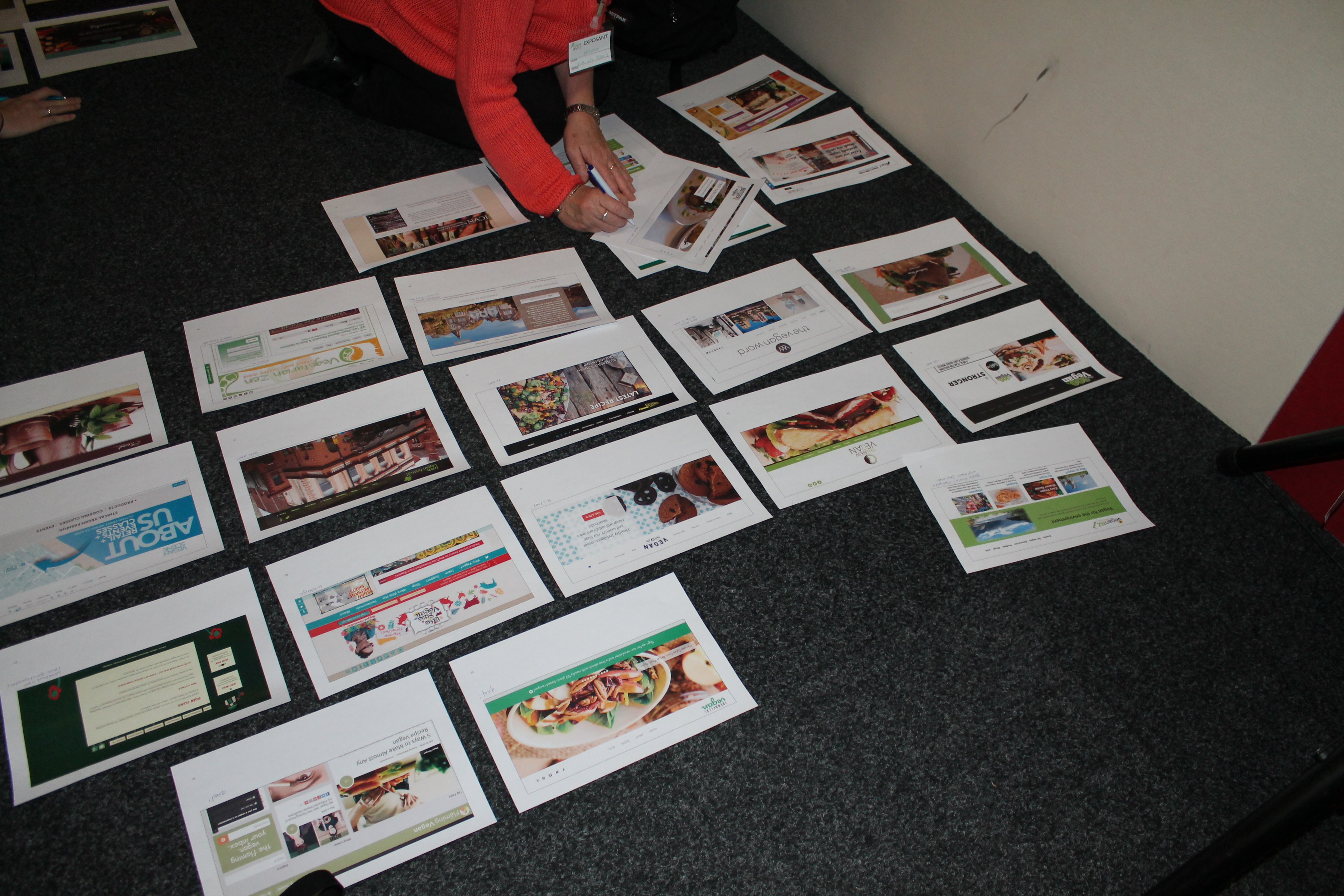
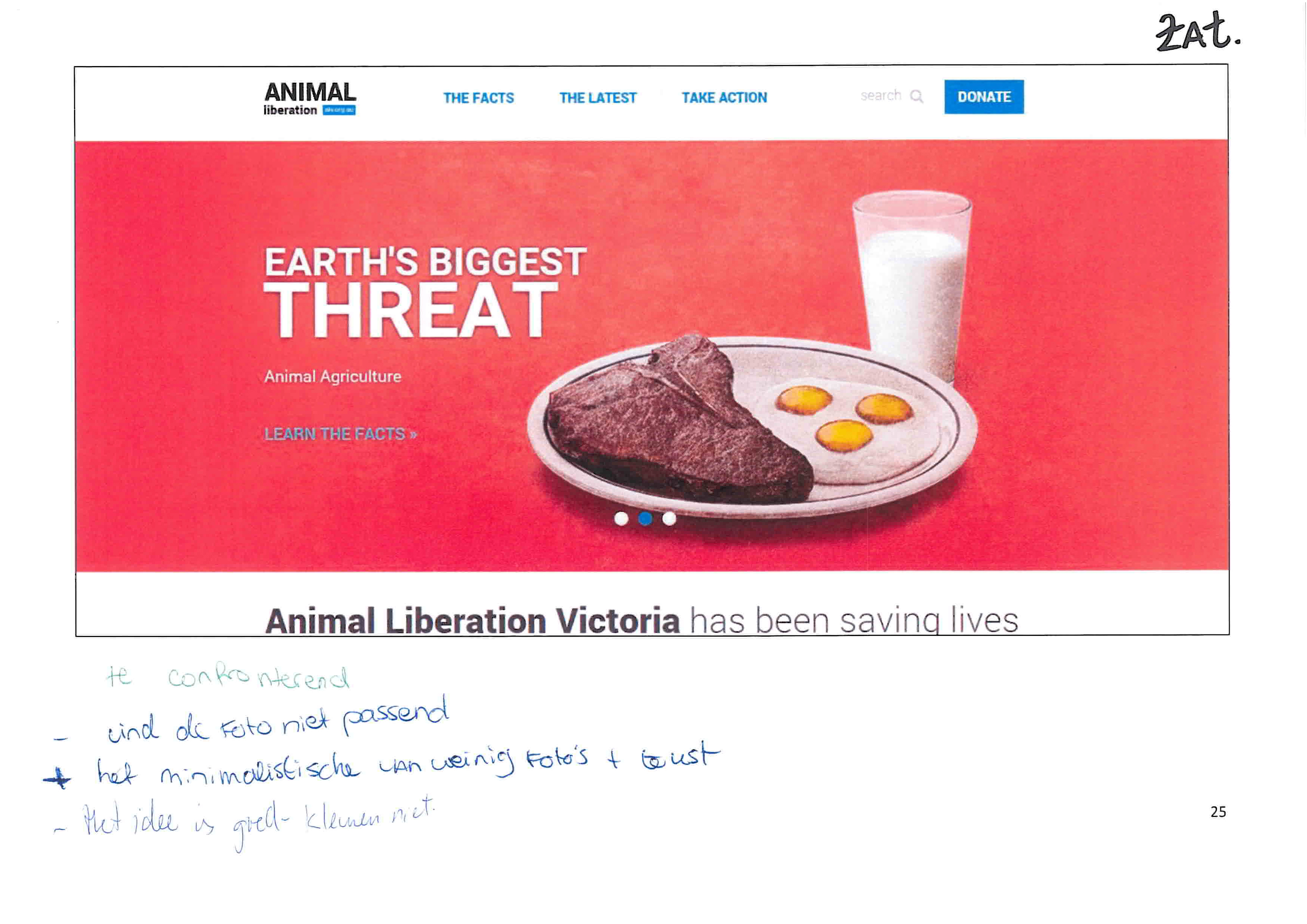
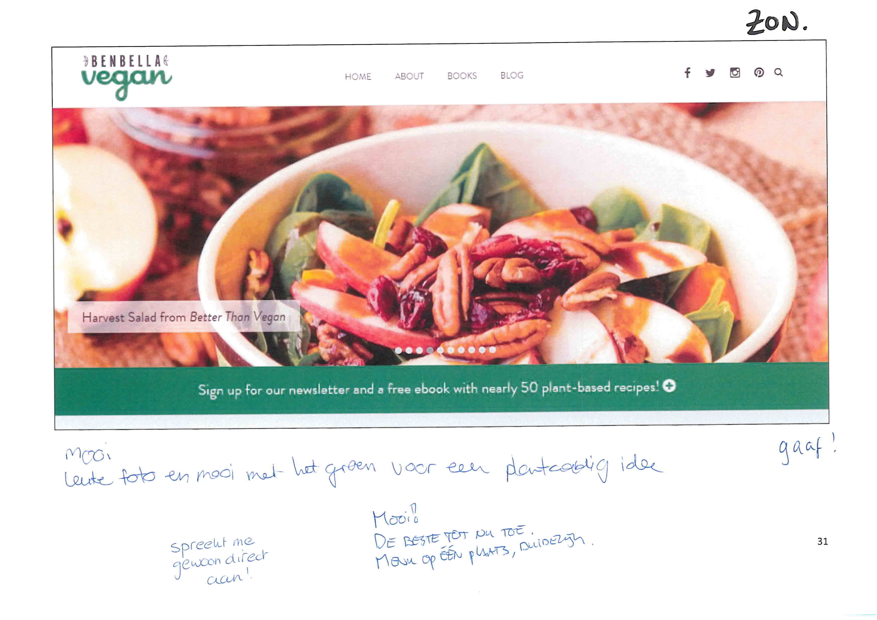
Focusgroup sessions
To get in direct contact with the target group, I organized two focusgroup sessions on different days, in which I mainly focussed on the look & feel of the new website(s): the first part of these sessions was giving feedback on 50 printed homepages of comparable organisations. With the help of direct interaction and group conversations, I got a good impression of the preferences of the target group.
Events
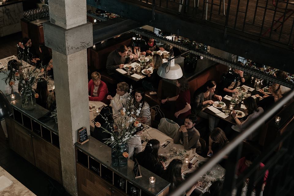
The omnivore: this is the segment of the target group that is most difficult to reach by Viva Las Vega’s. By visiting events (a vegan brunch for omnivores to get acquainted with veganism and handing out brochures about veganism to omnivores) I got into direct contact with this specific segment.
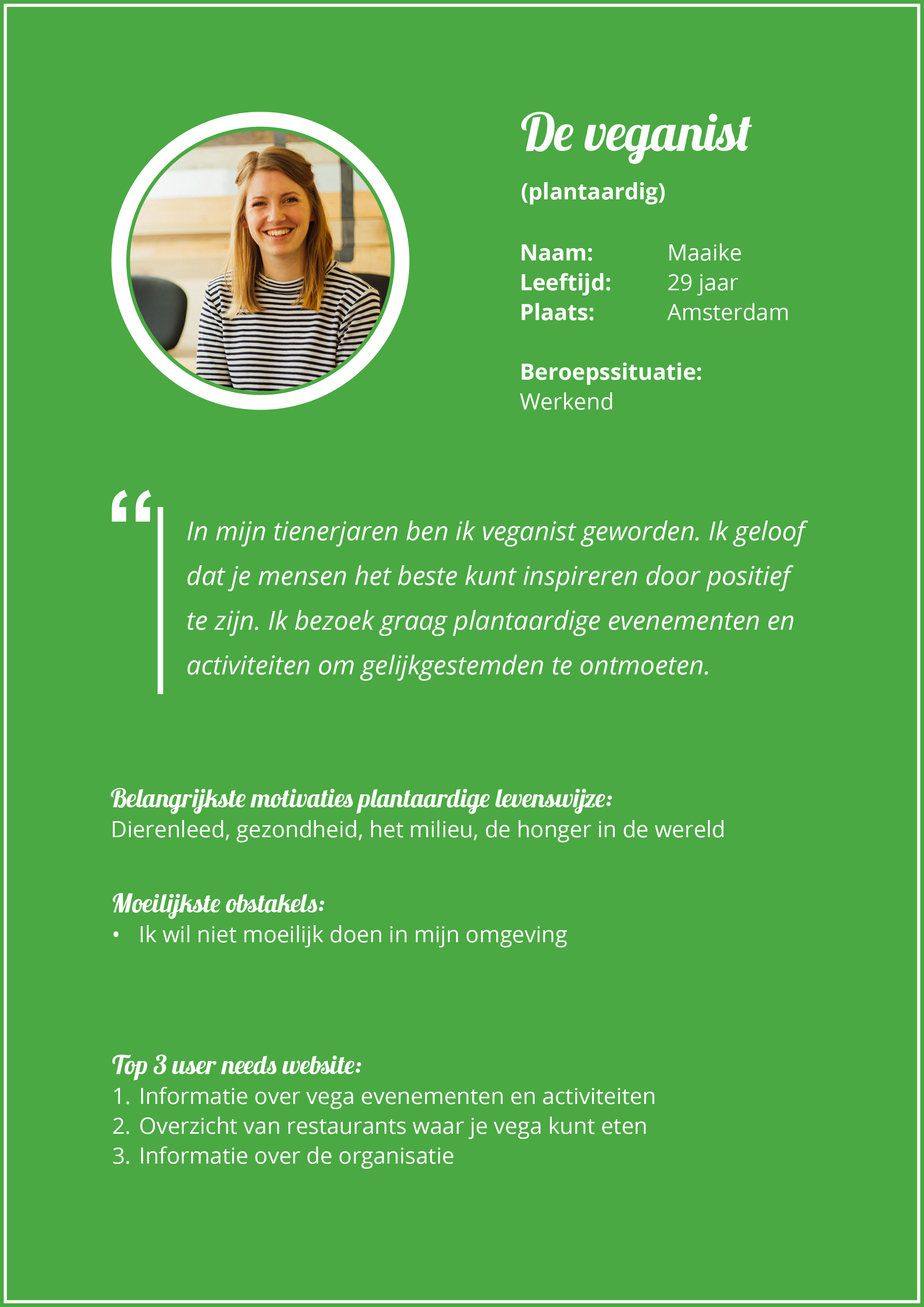
Personas
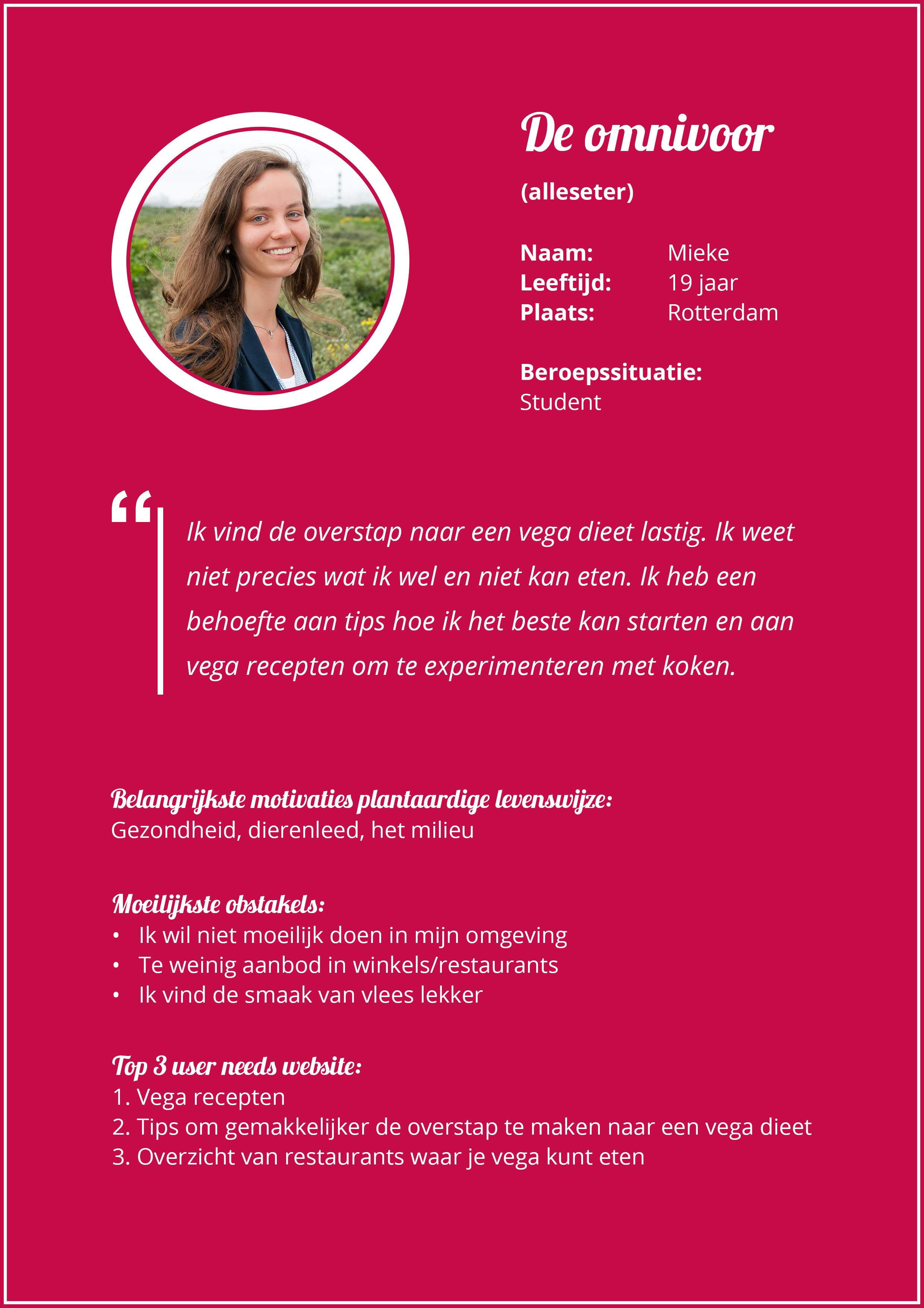
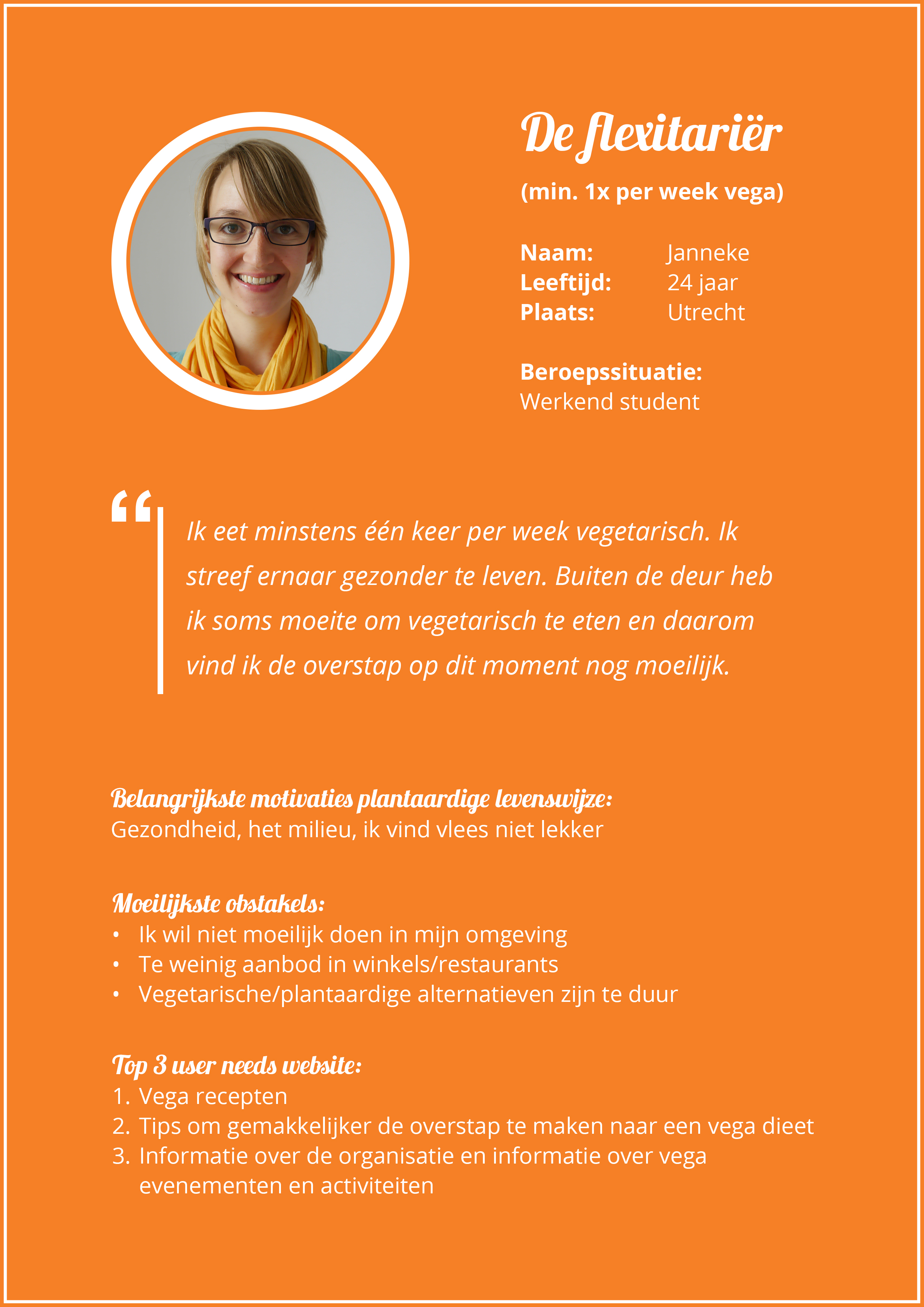
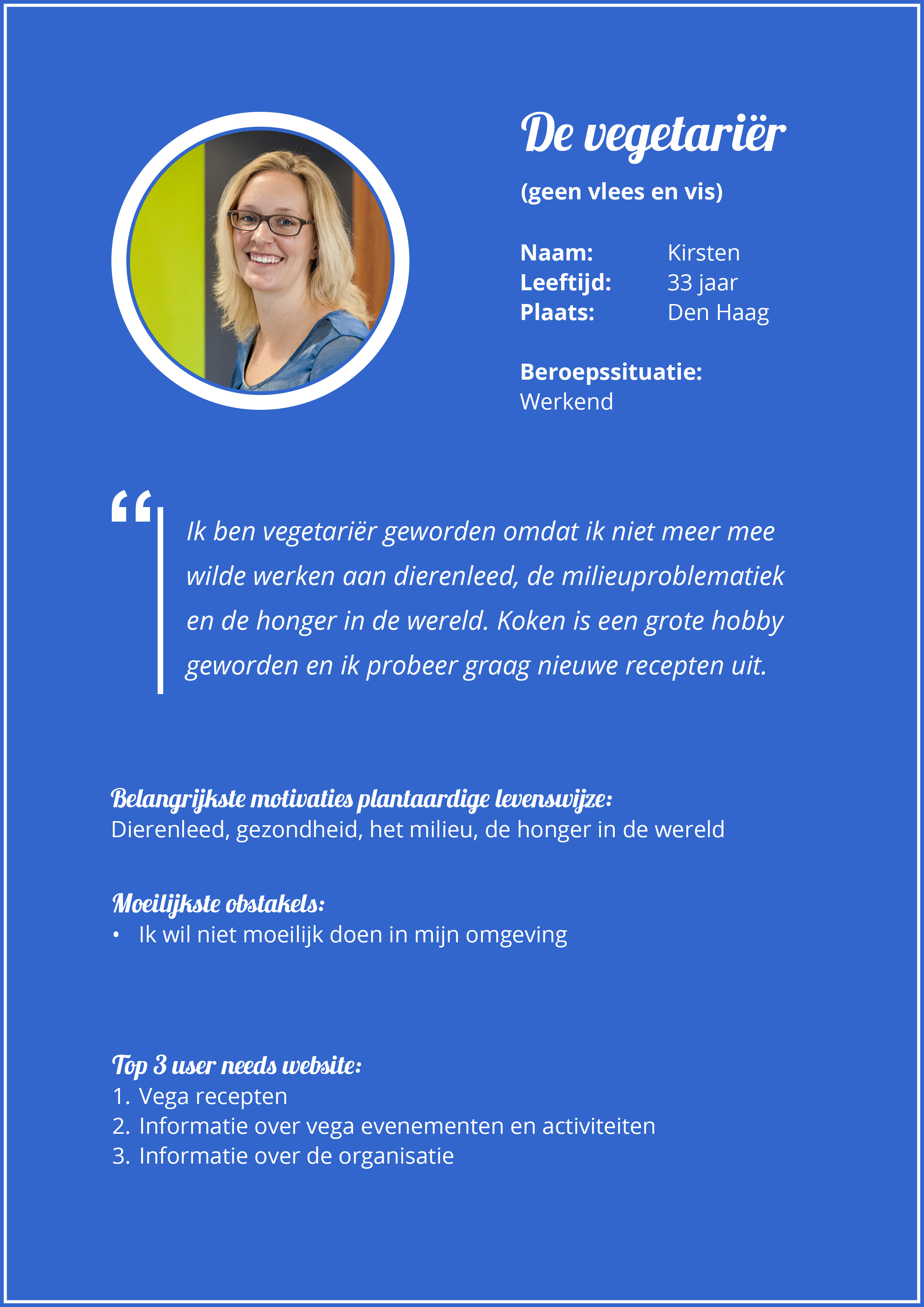
After the target group research I created a target group definition with the result of the analysis of the information from surveys, focusgroup sessions, events and several external sources. I divided the target group into four segments: the omnivore, the flexitarian, the vegetarian and the vegan. For each segment I created a persona with the most important motivations, the most difficult obstacles and the most important user needs.

3. Concept phase
The concept phase consisted of creating website options, creating website concepts and choosing a concept.
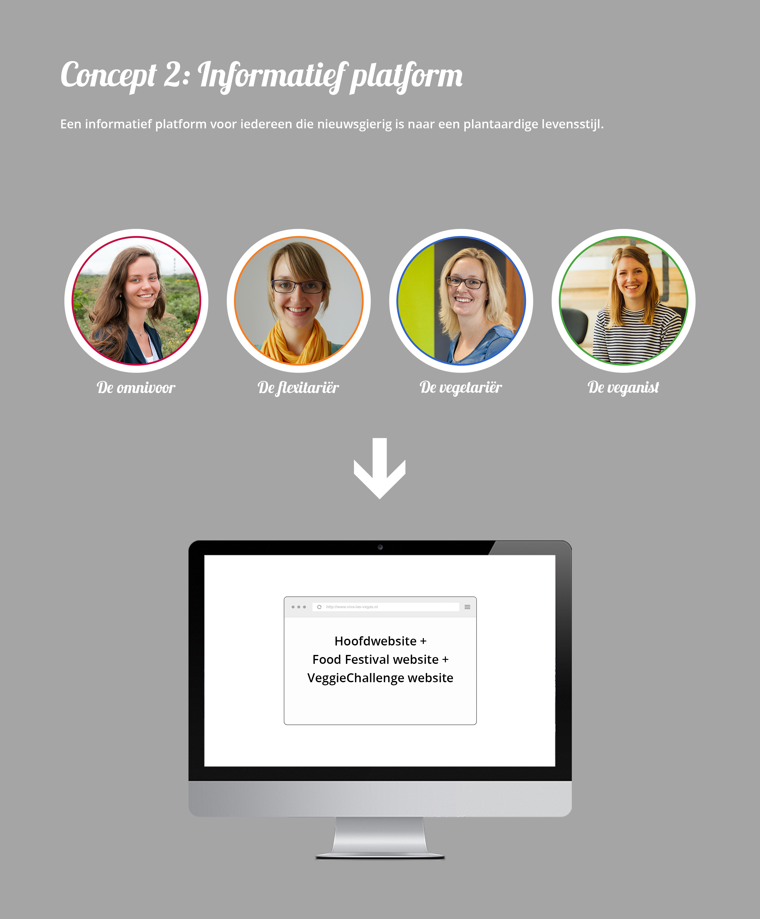
Informative platform
An informative platform for everyone who is curious about a vegan lifestyle. In a conversation with the client about the website options and concepts we have jointly decided to combine the three websites: the client wanted to carry out all activities of Viva Las Vega’s via one platform.

4. Design phase
The design phase consisted of creating a lo-fi prototype and testing the lo-fi prototype with the target group.
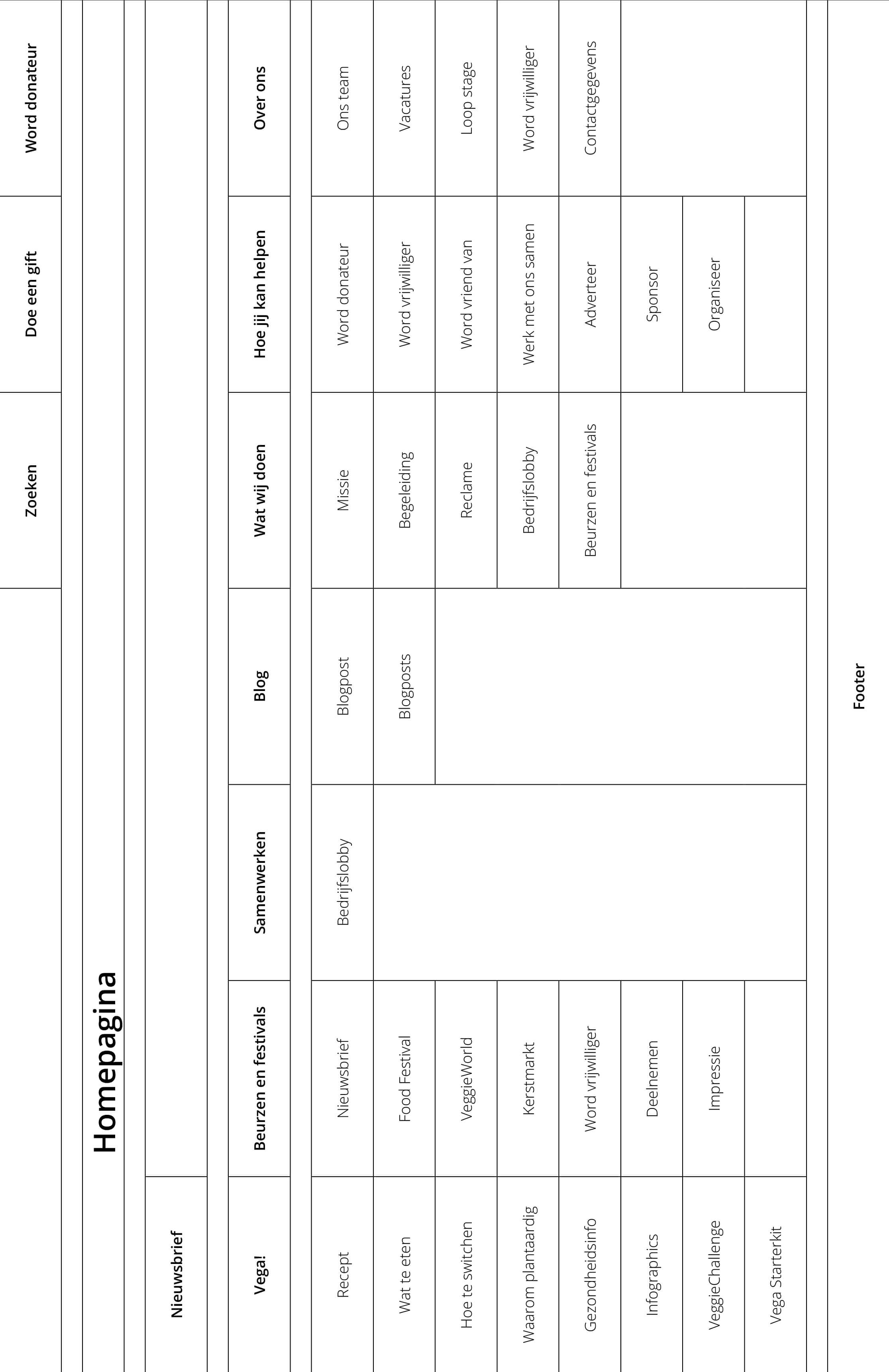
Sitemaps
Of each webpage I created a sitemap, which also served as a summary for the lo-fi prototype.

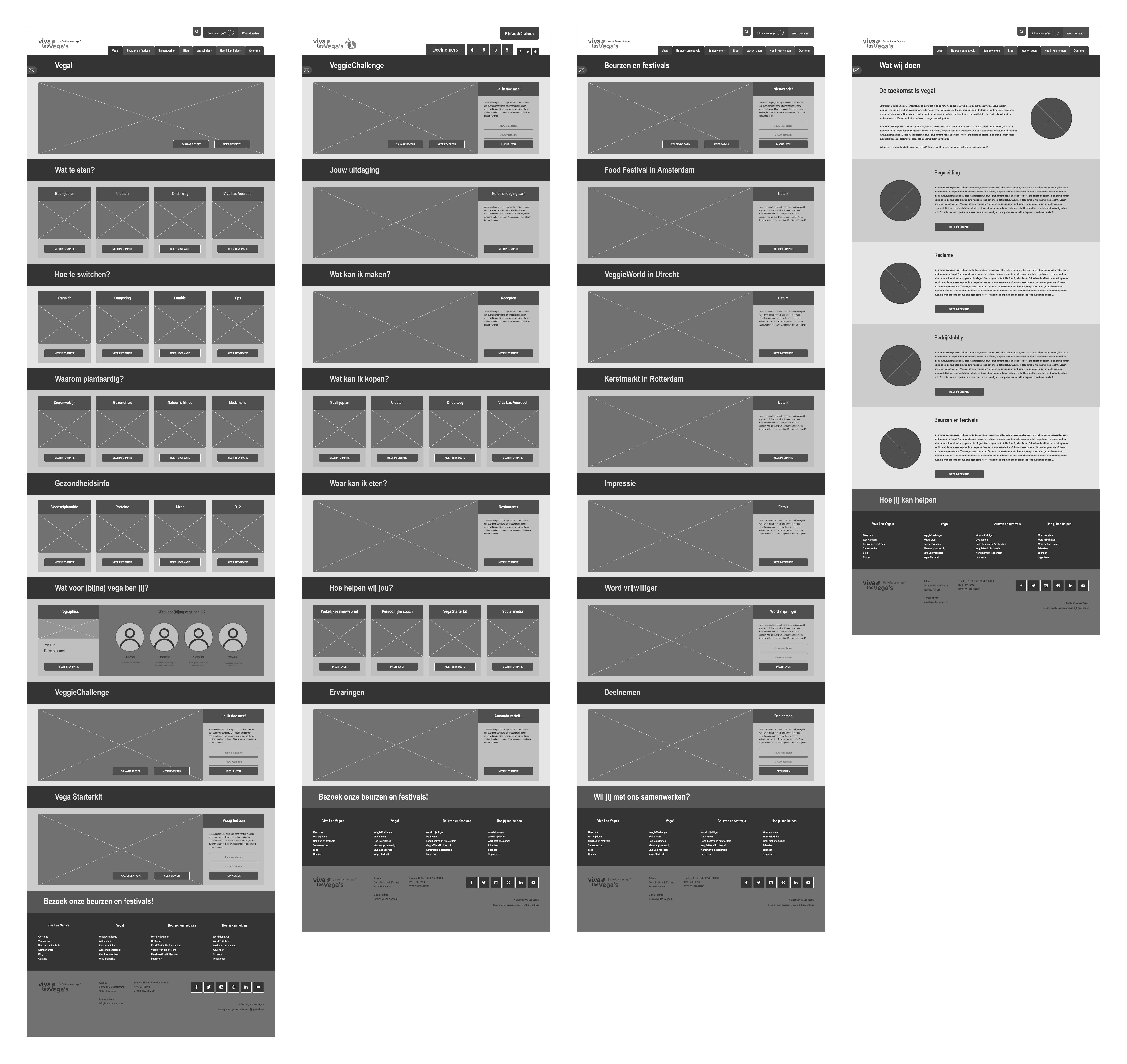
Wireframes
Several wireframes of different web pages, which I made clickable in a lo-fi prototype. The lo-fi prototype can be viewed on desktop, tablet and mobile.
Usability test
After I made the lo-fi prototype clickable, it was time to test. The lo-fi prototype is tested on usability and whether the several segments of the target group are addressed optimally.
Main question:
To which degree does the lo-fi prototype appeal to the needs of its users in the field of functionality?
Sub questions:
1. How effective is the division of the website? 2. How effective is the interaction between the pages of the website? 3. Does the design fit with its users? 4. Is it clear to the user how he/she can request the information he/she is looking for? 5. Is the user being optimally addressed in his/her user needs?
Feedback
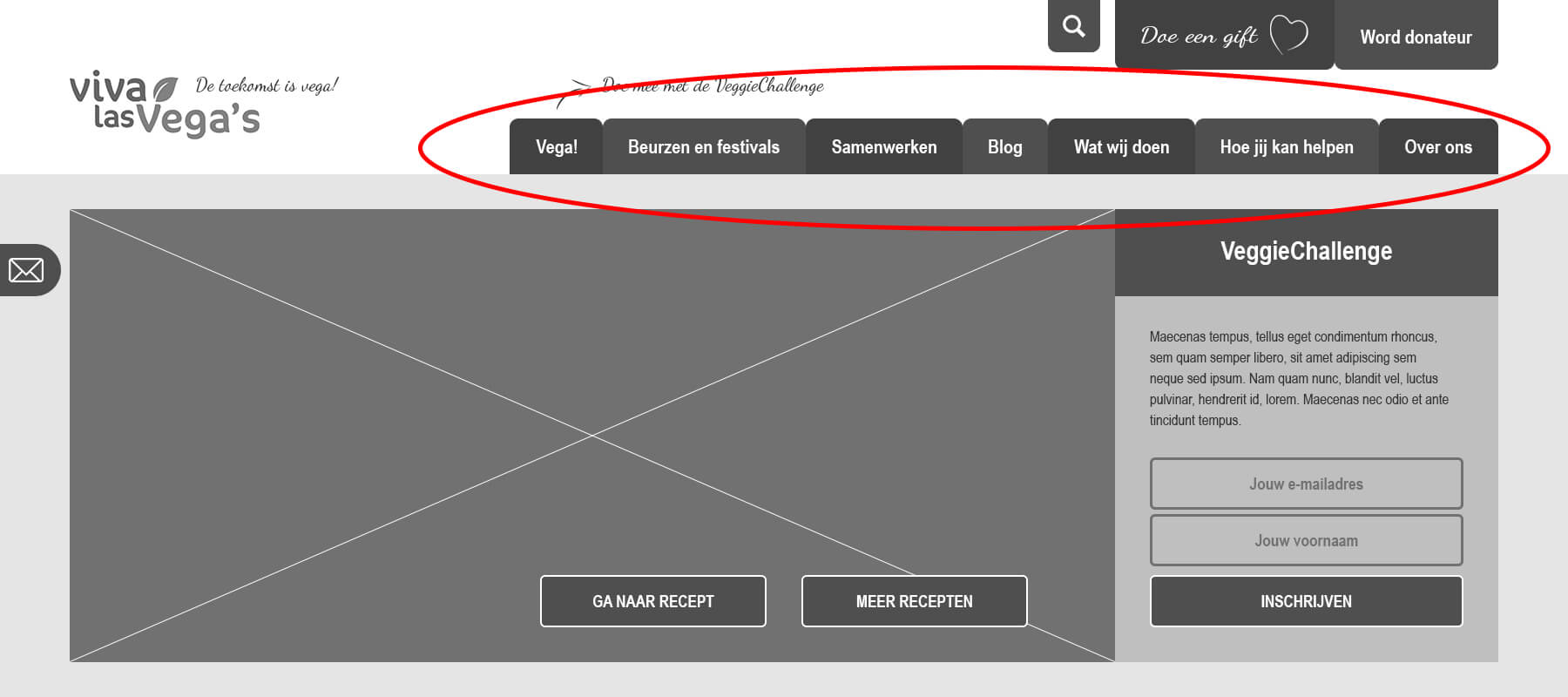
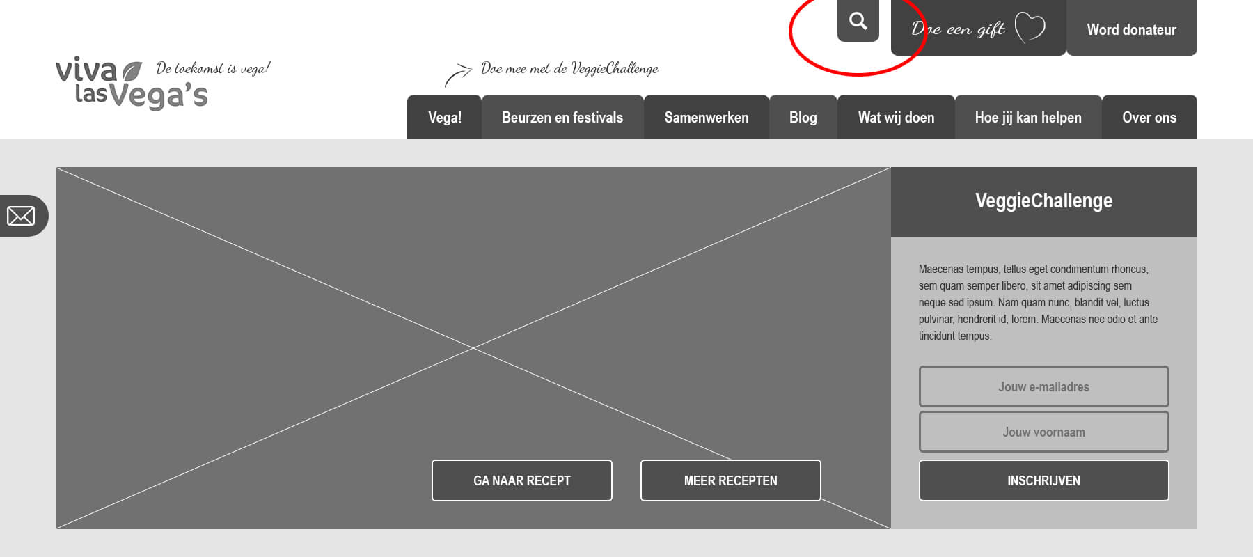
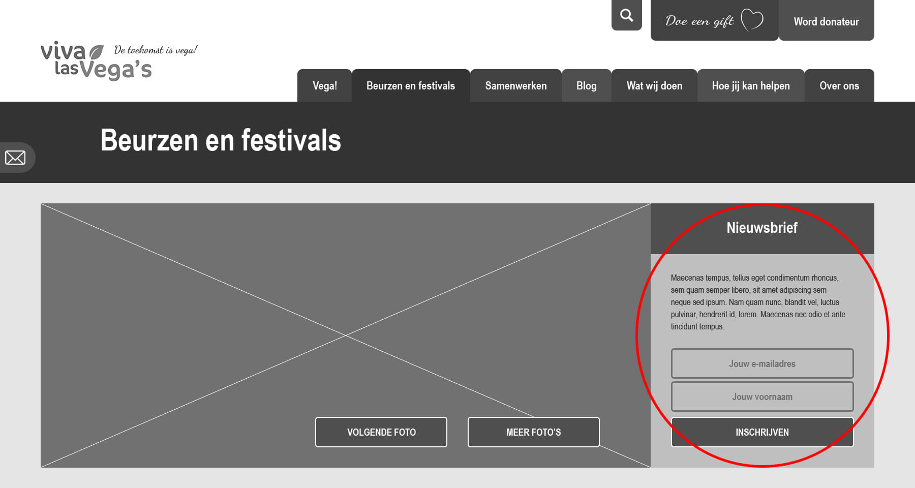
After processing the results of the usability test I came to the conclusion that I found myself in the middle as a designer: the preference of the client and my own preference and expertise as a designer. An important test result was the fact that almost every test person indicated that the division of the navigation menu did not feel natural. This division was tailored to the needs of the client, while I as a designer had a different preference. Since I wanted to carry out the division of the navigation menu well thought in the hi-fi prototype, I decided to create an A/B test for the target group. Two examples of other striking test results: the search menu is not user-friendly, subscribing for the newsletter is in the wrong place (should be above the homepage).

5. Realisation phase
The realisation phase consisted of conducting A/B tests, creating a corporate identity, designing a hi-fi prototype and giving advise to the client.
A/B tests
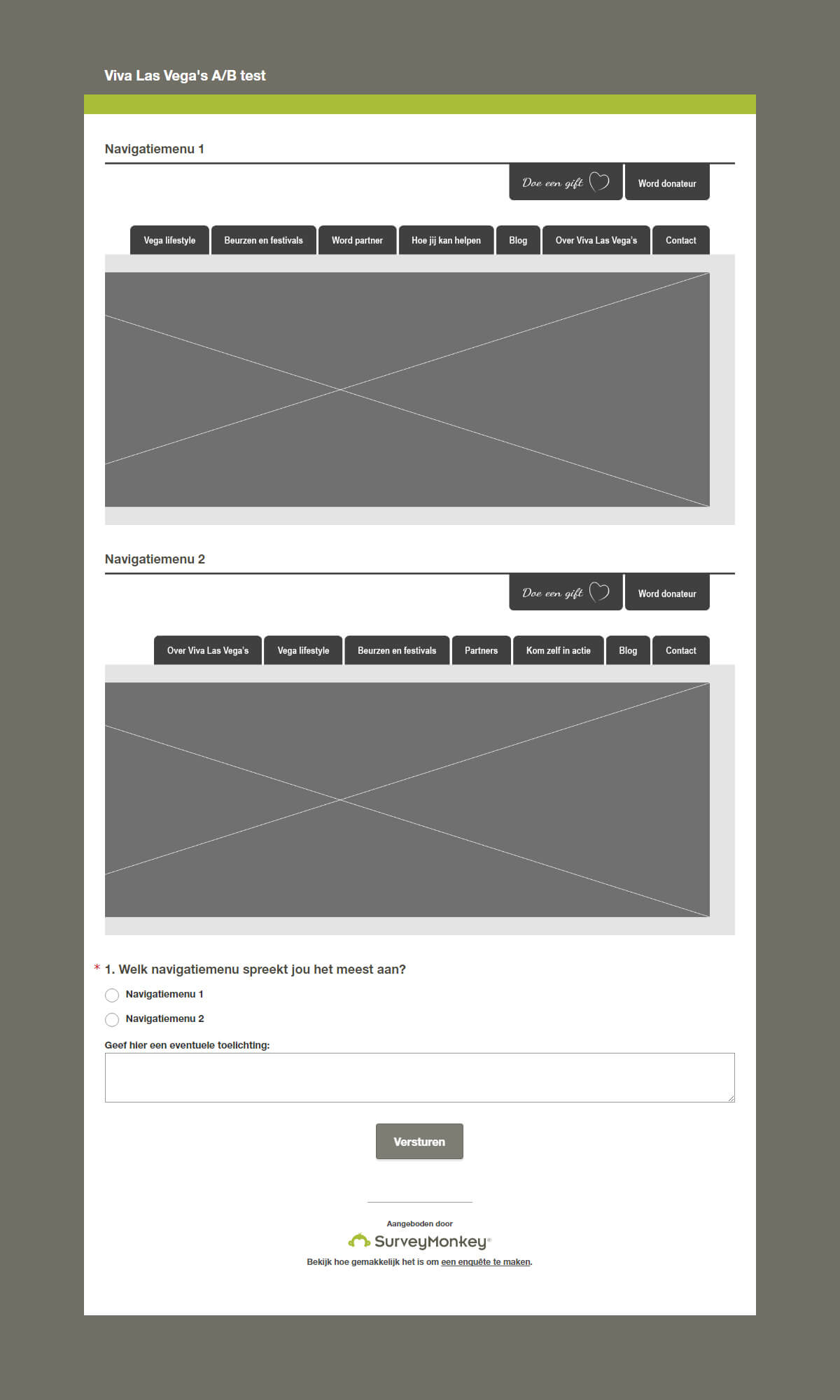
I conducted multiple A/B tests, including one about the division of the navigation menu. I asked the target group to choose between two options by asking ‘Which navigation menu addresses you the most?’ Respondents clearly had a preference (over 70%) for navigation menu 2.
Corporate identity
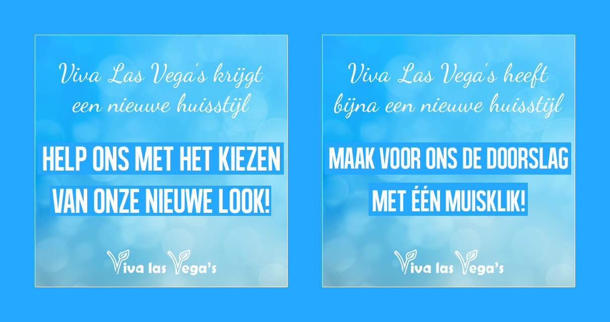
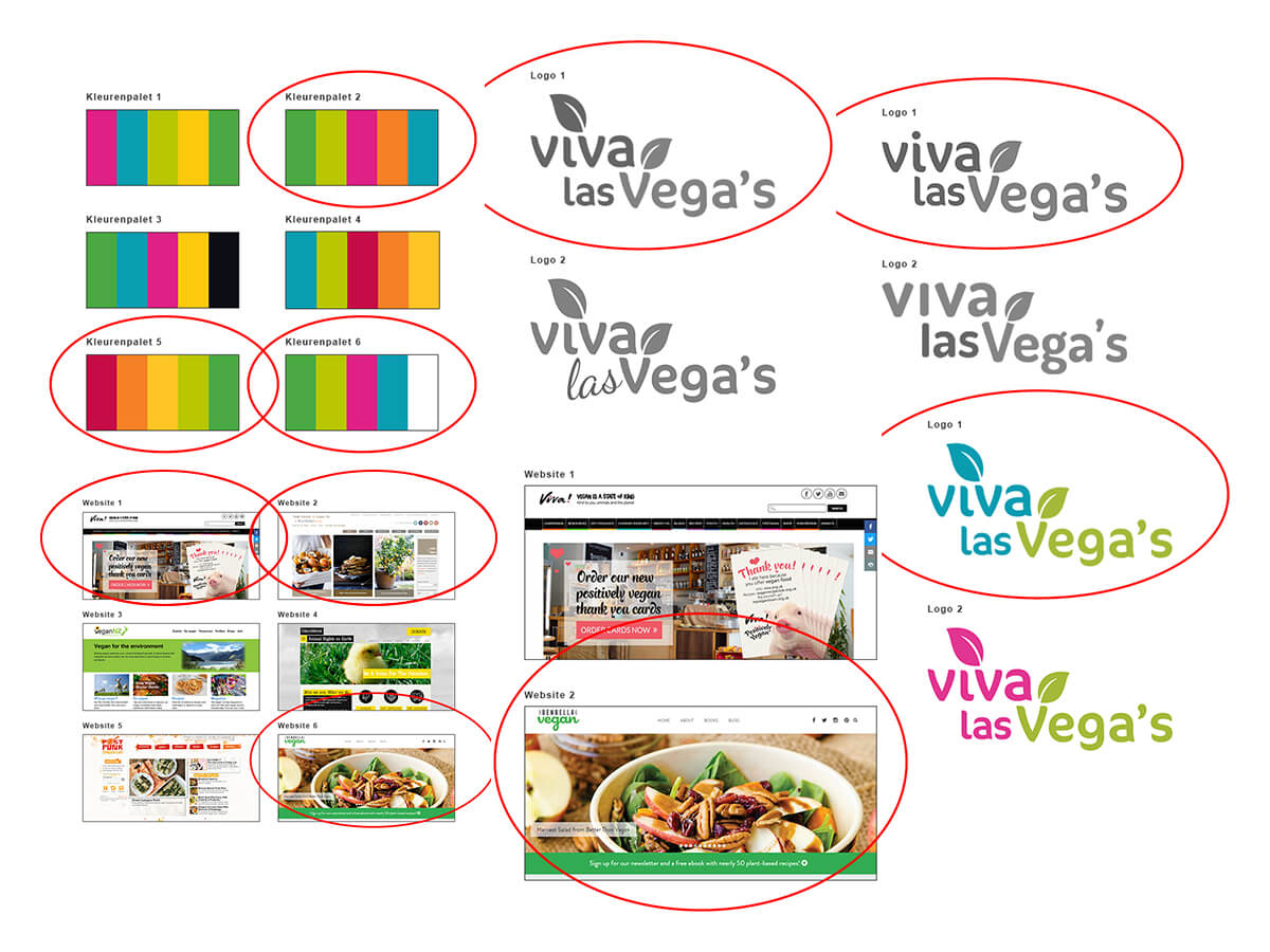
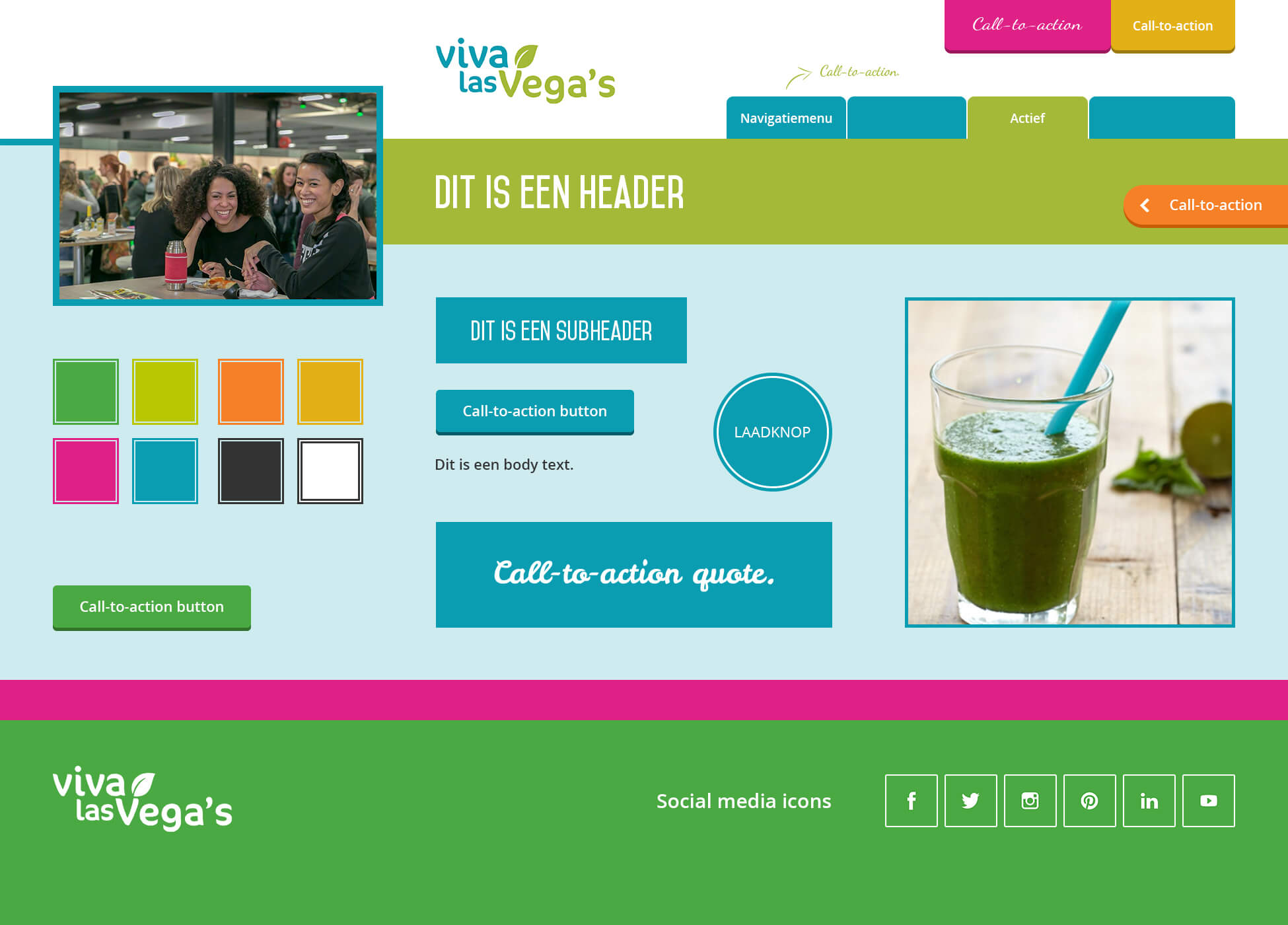
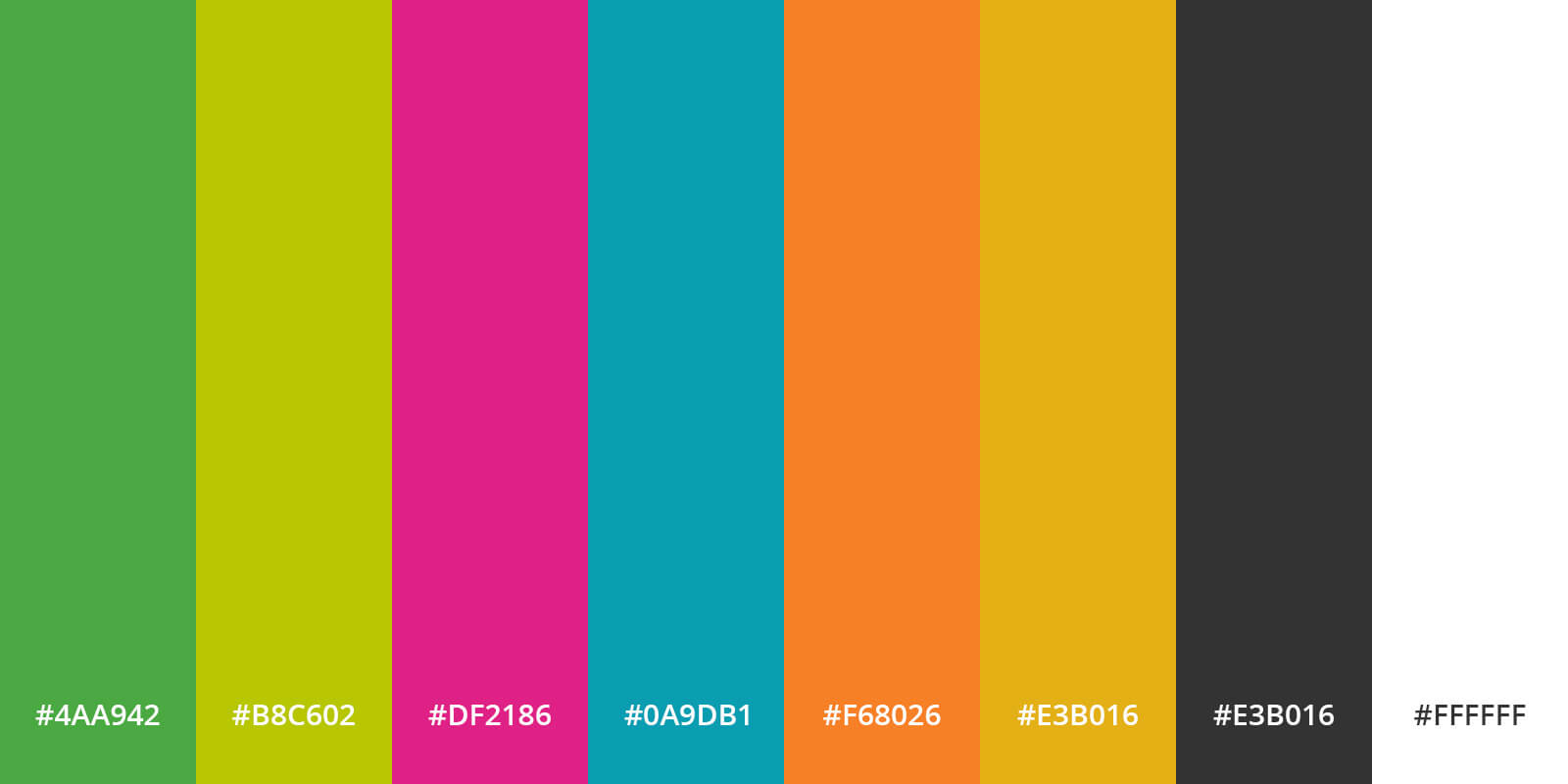
Via the surveys which I prepared (via a two-day event, social media and interviews) and conducted I received the preference and feedback from respondents regarding the logo, color palette, typography, iconography, navigation and the general look & feel. Viva Las Vega’s wants to base its corporate identity on the preferences of its target audience.
Converting wireframes to visuals
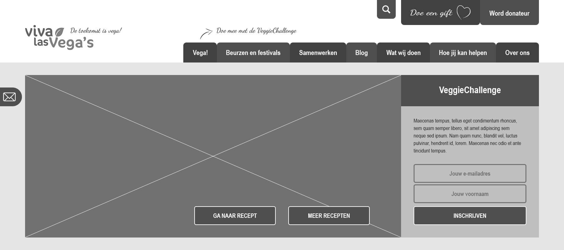
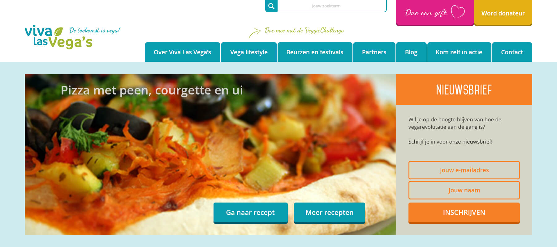
In this example, an insight is shown in how I converting the lo-fi prototype – with the test results from the usability test – to the hi-fi prototype. The layout of the navigation menu has changed (also because of the result of the A/B test), the search option has been folded out and the location for registering for the VeggieChallenge has changed to subscribing to the newsletter. The option to collapse the newsletter on the left is removed as well, because most of the test subjects overlooked this option during the usability test.


Current versus new design
On the top image the current design page (top) of the homepage can be seen, on the bottom image the new design (top).

Current versus new design
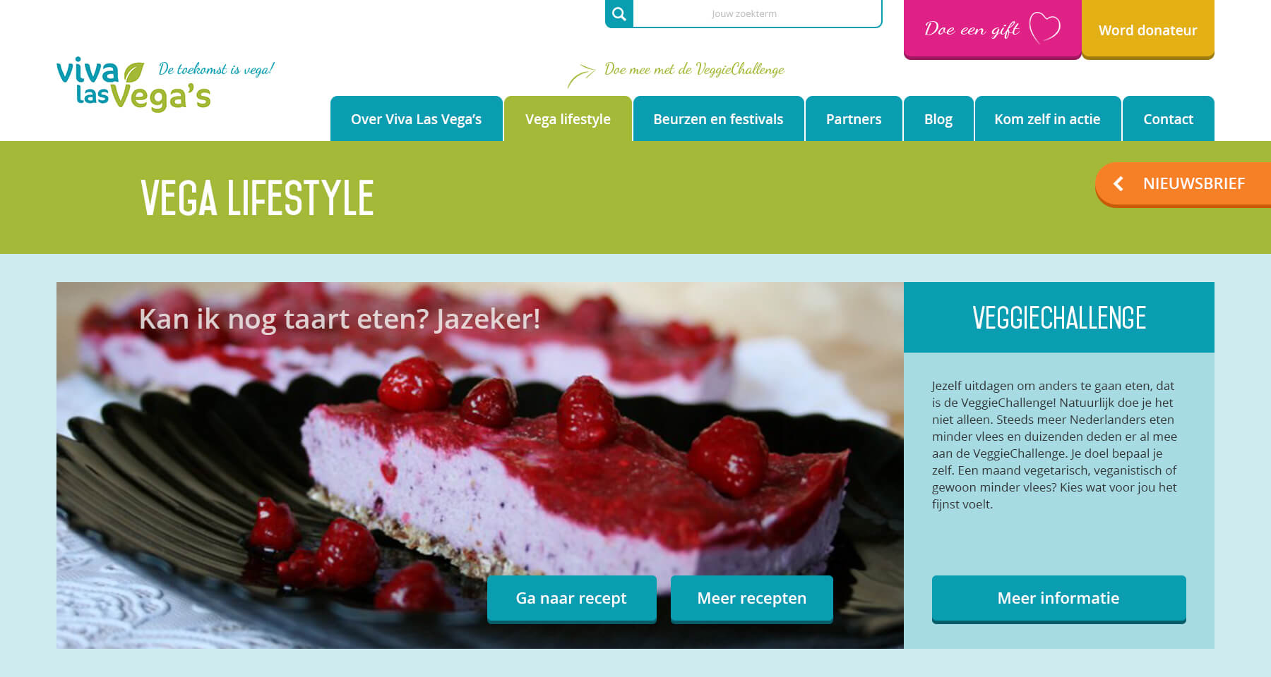
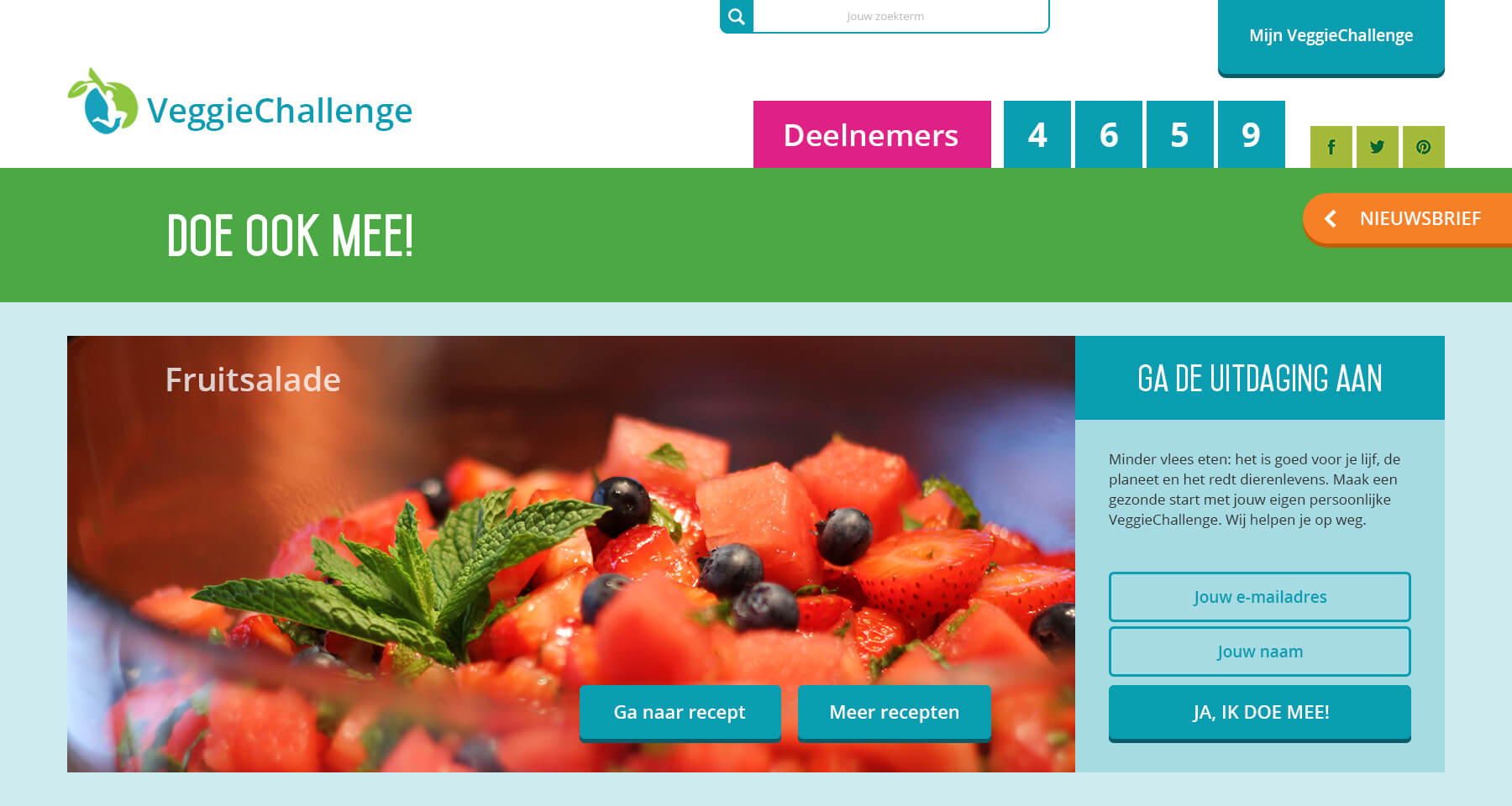
On the top image the current design page (top) of the VeggieChallenge can be seen, on the bottom image the new design (top).

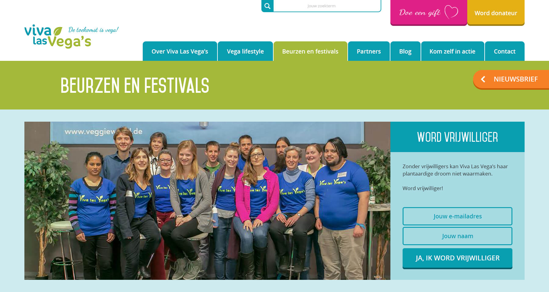
Current versus new design
On the top image the current design page (top) of the ‘beurzen en festivals’ can be seen, on the bottom image the new design (top).

More images


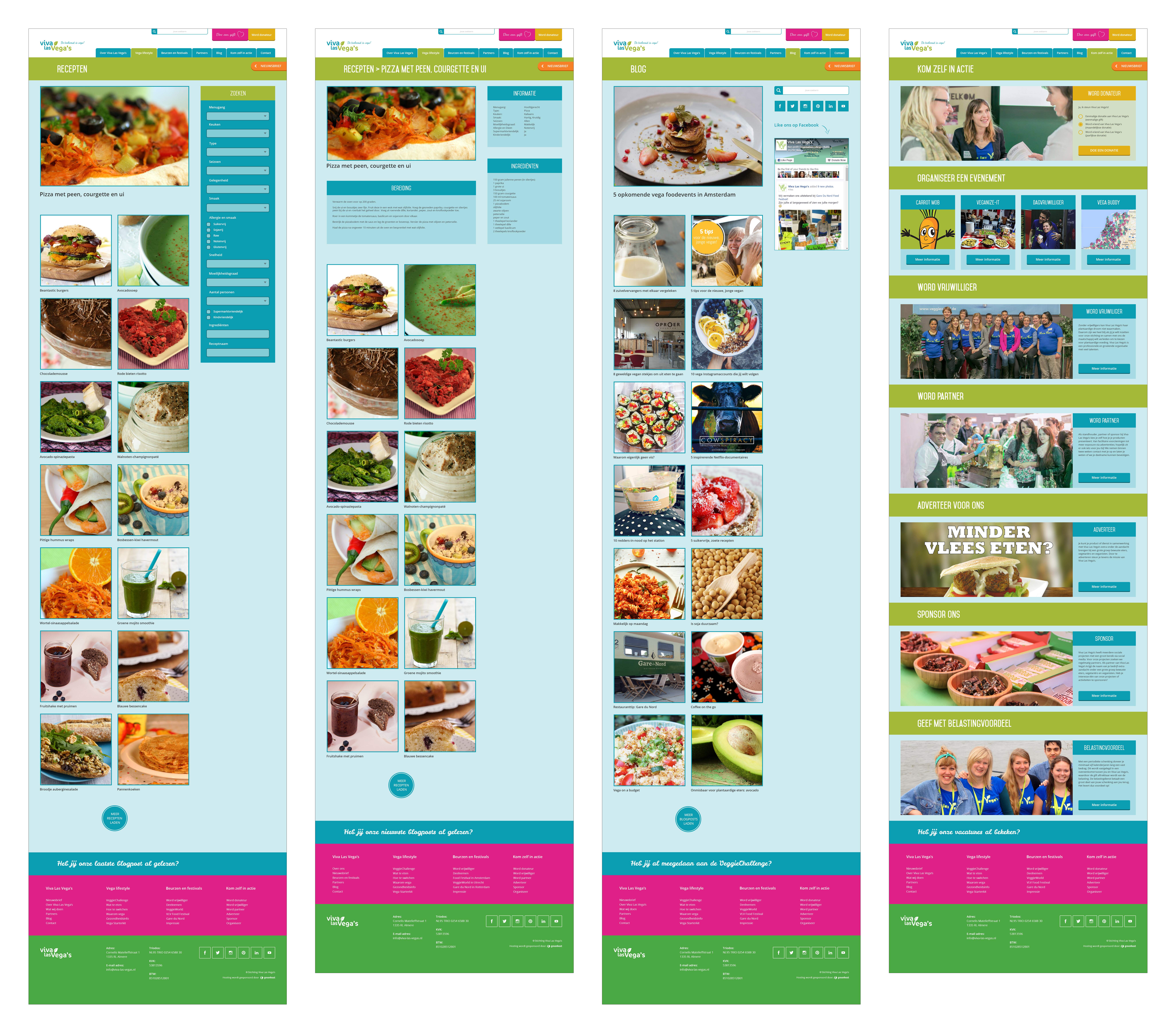
Hi-fi prototype
After converting the wireframes to visuals, I started creating the clickable hi-fi prototype. The hi-fi prototype can be viewed on desktop, tablet and mobile.

6. Evaluation phase
The evaluation phase consisted of the evaluation of the process and the evaluation of the products.
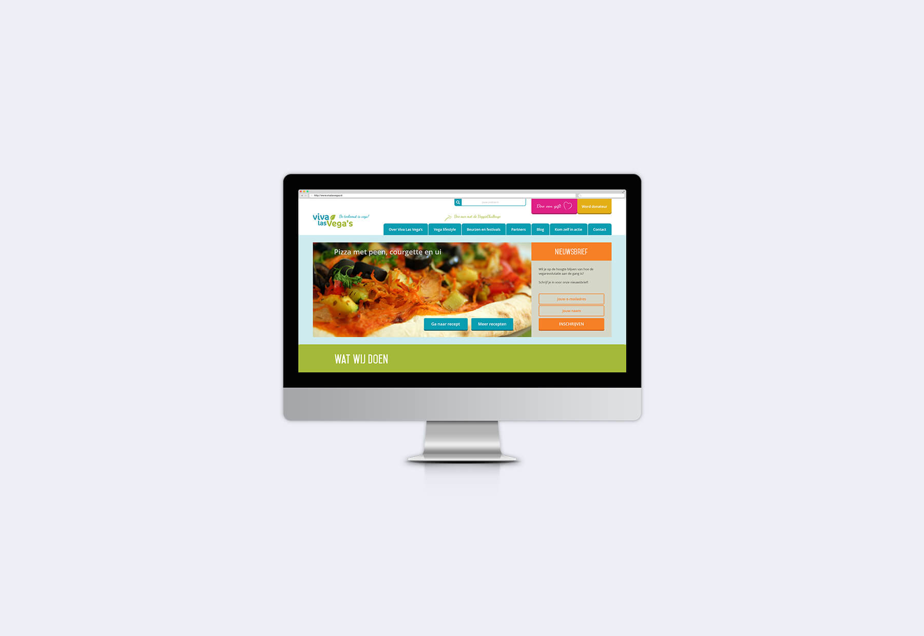
Viva Las Vega’s website 2.0
After my graduation Viva Las Vega’s received donation money to realize my final product (the website). The new website is live since the end of February 2017.